Quantcast
Viewing all 357 articles
Browse latest View live

Neat New Griffey Things

As the title suggests, here is a handful of neat new Griffey things.  Enjoy!


I was getting something framed when I came across this great collage frame for super cheap.  Naturally, I picked it up and stuffed it with Griffey cards.  All of these are duplicates that I mounted in their penny sleeves, so I have no need to remove them from the Griffey counts.  Is this maybe a little obsessive?  Nah...


1999 Upper Deck Retro was sold in metal lunch boxes.  This is a novel idea that I'm surprised no one else has done.  The condition is solid for being 15 years old, and the coloration is classy and attractive.  I miss you, Upper Deck.


Last but not least is this trio of 1998 SPx Finite Samples.  The red is #/2500 and the other two are #/10000.  I don't know the backstory behind these (samples that are actually numbered?). but they're really cool and look great together in the binder.

Sorry to all you Griffey loyalists out there for the recent expansion of my horizons into into the non-Griffey realm (Cavalcade of Keepers, new PC announcement and such).  I assure you I still have a very unhealthy obsession with Griffey cards and will continue to do so.

Thanks for reading!

Cavalcade of Keepers 3


You know the drill by now, right?  Let's get to it:

Image may be NSFW.
Clik here to view.
2001 Topps Archives Reserve Reprint
Jackie Robinson #70

Striking portrait of Jackie in a super-bright, shiny chrome holofoil?  Yes, please.  This whole set is pretty excellent in both concept and execution.  I wasn't collecting when this came out, but I assume it was a big hit.

Image may be NSFW.
Clik here to view.
2001 Topps Archives Reserve Reprint
Larry Doby #21

Because it's a big hit with me.  I found a ton of them in my LCS dollar box and picked up a bunch.  Larry is just as big a civil rights hero as Jackie Robinson but never gained the notoriety Jackie did.  The guy is very close to becoming one of my player collections.

Image may be NSFW.
Clik here to view.
2001 Topps Archives Reserve Reprint
Roberto Clemente #17

The horizontal designs are my favorite vintage Topps designs without a doubt.  Throw in Clemente, chrome, and holofoil and you;ve got yourself a keeper.  Great card.

Image may be NSFW.
Clik here to view.
2001 Topps Archives Reserve Reprint
Johnny Bench #6

I think it's the backwards cap and fresh-faced portrait of Johnny as a youngster that won me over with this one.  I, like every other collector on the planet, would love to get my hands on an original.

Image may be NSFW.
Clik here to view.
2010 Topps Pro Debut Autographs
T.J. Steele #PDA-TS

Threw you a bit of a curveball there, didn't I?  I picked this up for the mere fact that his name is T.J.  That's my name!  I'm always interested in seeing how other T.J.s sign their name.  This one has style.  I've put you in a post among some of the best players there ever were, fellow T.J.  Make me proud!

Thanks for reading.

2001 SPx: SPx Gets Their Base Card Groove Back

As guilty as this set is of that same lines-for-the-sake-of-lines design that Upper Deck seemed to rely on year after year for everything from base cards to inserts and subsets, 2001 SPx is one of the better-looking base designs of the year. It’s also among my favorite SPx base sets in general, certainly better than the headache-inducing design of the previous year. That being said, the inserts do leave a little to be desired.

Let’s jump right in:

Image may be NSFW.
Clik here to view.
2001 SPx #85
Image may be NSFW.
Clik here to view.

It’s a difficult aesthetic to describe, but it seems to be defined by the use of parallel diagonal lines, lots of foil in both silver and gold, and large frames of sepia shading that bring out the colors in the rest of the card. You can see behind Mr. Junior there that window of stadium backdrop looks especially blue and green. Like salt on watermelon makes it taste sweeter, all that sepia makes this card look much more colorful. The bottom-mounted nameplate with the player’s uniform number and team logo in gold foil are also thoughtfully placed. While it could be considered a bit busy, somebody really designed the hell out of this thing.

I can’t say the same for the back, though. The big, square stat box is an inorganic eyesore against the diagonal lines of the rest of the card, but this is a minor issue compared with that text. As you can see it’s comprised of two sentences:

Sentence 1: “Griffey returned to his hometown during 2000 with the Reds.”

Oof – what a clunker. We get a “during 2000” which is the long, terrible way of saying “in 2000.”  Then there’s the big, honking dangling modifier “with the Reds” just hanging off the end like a limp salami.  Am I being too picky?  No way.  We’re talking Griffey cards here, people.

Sentence 2: “The All-Star and Gold Glove outfielder remains one of the best players in the game and he is hoping to help Cincinnati reach the postseason sometime in the near future.”

First of all, this could have been written by anybody who was simply aware of Griffey’s trade to Cincy. Way to flex your industry insider muscle there, guys. Moreover, the wording here is passive and callow.

Interior: Upper Deck offices. Upper Deck’s Card Blurb Editor-in-Chief removes a cigar from his mouth and tucks his thumbs under his suspenders. “Alright boys, we need to write the blurb for the back of the SPx Griffey base card. Who’s got something fresh and bold? Let’s think outside the box here, people!”

Fresh-faced “writer”: “Well, I would assume he hopes to help the Reds reach the postseason.”

“Of course he does, but when!?”

“I don’t know. S-sometime?”

“…”

“In the near future?”

“Perfect! Print it!”

Weak words like “hopes to help,” “sometime,” and “near future” should never be used for the hero on the front of this card. Junior deserves something active and sure. “Griffey intends to lead the Reds to a World Series Win, like, tomorrow. Then, two more.” Bam. There’s your freakin’ card blurb.

Oh, and I’m no Hemingway, but I know to separate independent clauses joined by a coordinating conjunction with a comma. Amateurs.

Apart from all this, I really dig the look of this card.  The sample looks great, too:

Image may be NSFW.
Clik here to view.
2001 SPx Sample #001

Despite the blurb being covered by the big "SAMPLE," you can still tell it was better than the one that made it onto the base card.  Sigh.

Image may be NSFW.
Clik here to view.
2001 SPx Foundations #F4

The Foundations insert kind of looks like a subset. The shiny iridescence on the front is nice and the design is okay, but they doubled up the design on the front and back with only superficial differences between them. This is also the only non-relic Griffey in the set with the SPx logo not in the top left corner.

The blurb on the back includes the sentence “He is hoping to reach the playoffs with the Reds in the near future.” Now, let’s look again at the blurb on the base card: “…he is hoping to help Cincinnati reach the postseason sometime in the near future.” SMDH.

I’ll go ahead and mention now before we go through that again that all the non-relic inserts from 2001 SPx kind of look like subsets. They also all kind of resemble each other, and none of them look as good as the base card.

Image may be NSFW.
Clik here to view.
2001 SPx SPXcitement #X3

I’ve always liked this name for an insert - it’s clever and written in a cool font. I even like the back design and the blurb. The only critique I have is that the player name is super tiny; but if you don’t know whose card you have here, how on Earth did you end up holding an insert from 2001 SPx?
Again, a great font used for the insert and yet another mirroring of the front layout on the back. This blurb makes a hell of a lot more sense, too. It’s like somebody took the blurbs from the other cards, mashed them all together, and properly edited it. The opposing corner squares layout works well with the name of the insert (similar squares don’t actually touch, hence Untouchable, or am I reading too much into that?), but again the player name is super tiny town.

I really want that “Untouchable” font on my computer. It looks like a movie title.

Image may be NSFW.
Clik here to view.
2001 SPx Winning Materials Game-Used Jersey/Bat Combo Relic #KG1

These Winning Materials combo relic cards are very available for being double relics. I have two of them and my Griffey guy still has more to sell me. It’s also the only ’01 SPx Griffey relic on COMC as of this post. Maybe it’s the fact that the relics are so small that they were able to make so many, but it’s everywhere. I’ve seen this card priced at twelve bucks, and I’m like, “Keep dreamin’, compadre.” At least the color of the jersey swatch on nearly all the Griffeys I’ve seen is blue, so it looks like these are Mariners relics on Reds cards. That’s kind of cool.

As you can see, the design is a bit scant with a lot of empty space and the primary focus of the card being the big, red X containing the relics and logos. It’s not a bad-looking card, and I appreciate that there is heavy focus on the relics; but there’s zero difference among all the different relic cards from this brand. They are identical whether it’s a three-player triple relic or one of the sought-after Joe DiMaggio combo relics. All of them look just like this.

There are also no autos to be had. That makes my job of set completion a lot easier, but come on! This is a high-price premium brand. Throw an auto or two in there, guys. Or some patches. Mix it up. Give us a rabbit to chase.

Here are the Griffeys I need from 2001 SPx as of this post:

Need:
2001 SPx #85 Spectrum
2001 SPx Winning Materials Base/Ball #B-KG
2001 SPx Winning Materials Combo Jersey #KG-AR (w/ Alex Rodriguez)
2001 SPx Winning Materials Combo Jersey #KG-BB (w/ Barry Bonds)
2001 SPx Winning Materials Combo Jersey #KG-JD (w/ Joe DiMaggio)
2001 SPx Winning Materials Combo Jersey #KG-KG
2001 SPx Winning Materials Combo Jersey #KG-RJ (w/ Randy Johnson)
2001 SPx Winning Materials Combo Jersey #KG-SS (w/ Sammy Sosa)
2001 SPx Winning Materials Double Base #B2-MG (w/ Mark McGwire)
2001 SPx Winning Materials Jersey/Bat Combo #KG2
2001 SPx Winning Materials Triple Base #B3-GJR (w/ Derek Jeter & Alex Rodriguez)
2001 SPx Winning Materials Triple Base #B3-MGS (w/ Mark McGwire & Sammy Sosa)
2001 SPx Winning Materials Triple Jersey Combo #BGJ (w/ Barry Bonds & Andruw Jones)
2001 SPx Winning Materials Triple Jersey Combo #DGJ (w/ Joe DiMaggio & Andruw Jones)
2001 SPx Winning Materials Triple Jersey Combo #GRB (w/ Alex Rodriguez & Barry Bonds)
2001 SPx Winning Materials Triple Jersey Combo #SGC (w/ Chipper Jones & Sammy Sosa)

Maybe I was a little hard on this set, but it's only because I have such high expectations for SPx as a brand. I really do like all the cards covered here.

Cavalcade of Keepers 4


I can pump these things out pretty fast, huh?

Image may be NSFW.
Clik here to view.
2008 Topps Kazuo Uzuki Future Star #FS1

In 2008 Topps created a Japanese phenom from scratch and issued a card for collectors to chase unaware that this guy doesn't even exist.  Whan an asshole move!  When I heard this card existed I had to buy one for the simple fact that what Topps did sounds like something I would do.  Nice prank.  Kinda dick, but nice.

Image may be NSFW.
Clik here to view.
1984 Fleer Whitey Herzog Checklist #660 (autographed)

I found this checklist of Mr. Herzog in the LCS dollar bin and didn't have to think twice.  The guy's a legend and has a really cool signature.  Not a bad looking checklist, either, despite the stark whiteness (Whitey-ness?).

Image may be NSFW.
Clik here to view.
1982 Donruss Yogi Berra #387

I didn't even know Yogi had any cards this late in the game.  Plus he looks like a character from a Martin Scorsese film.  Super New Yorky, especially with those glasses.  Awesome card.

Image may be NSFW.
Clik here to view.
2014 Donruss Hall Worthy Mariano Rivera #1

This is a great insert.  You can't really tell here, but it's got some excellent interplay between matte and gloss printing along with a very slight embossing.  I'm nuts about these.  Well done, Panini.

Image may be NSFW.
Clik here to view.
1995 Pinnacle Zenith Hideo Nomo #48

Finally we have a card I would have killed for back in '95.  This shiny offering from Zenith is entirely in Japanese, even in the blurb on the back.  It's so gimmicky that it deserves to be documented.  Plus there's a Piazza cameo.  Can't beat that.

Thanks for reading!

Binge/Purge

I bought 3000 Griffeys.

I shy away from eBay lots because there’s not much they can do for me in the way of new Griffeys; but this one piqued my interest. The seller is a Griffey collector, and the auction was for all his duplicates. Get a load of the picture that accompanied the auction. Say hello to the Adelanto Lot:


I named it that because it’s from a collector in Adelanto, CA. I named it at all because this box is the catalyst for major change here at The Junior Junkie.

Now here’s a picture of my own duplicate box:


See what I mean? It’s someone else’s Griffey overflow box, and it looks just like mine (kinda)! The moment I saw it I knew I’d love nothing more than to root through that box like a pig sniffing for duplicate cardboard truffles.

I had to win the auction the old-fashioned way, but it went for less than I was expecting. It’s currently on its way to my house, and guess who has two thumbs and Thursday off work? This guy.

Simply put, my plan for this massive box of Griffeys goes like this:

1.            Buy it
2.            Take what I need
3.            Throw in what I don’t
4.            Sell it again

By the time I’m finished with this box it should have a couple of thousand more Griffeys than it did before. I’m expecting it to land around 5000, including most of the 3000 it arrived with. I’ll leave in everything of value that I don’t need (save for a few I want duplicates of) to preserve the overall value of the collection and put it right back on eBay for the next guy. If I make 80% of my money back it will have been worth it just to pour through all those cards.

This is also helping move along a project I’ve been putting off for some time: the great cleaning out of the binders. There was a time when I kept every Griffey card in the binders. ALL OF THEM. All fifty copies of the ’91 Upper Deck base card, all sixty or so copies of the ’90 Donruss base card, page after full page of identical overproduced junk wax. I used to get a kick out of going through all those pages, and it made it really easy to spot the variants.

Then the day came when some of the binders refused to close all the way. They stayed propped open by way too many pages. It was time to start imposing storage rules. The first rule: no more than a full page of the same card; thus the Griffey Overflow Box was born.

Image may be NSFW.
Clik here to view.
The First Generation Griffey Overflow Box(es).  I went out and bought that big 5000-count box literally the very next day.

This worked well for a while, but the 2005-2008 and 2009-present binders started to get ridiculous and difficult to store. The rules had to get even stricter: no more than three of the same card on a page not counting parallels.

I’ve been forced to apply this rule to the two aforementioned binders because they were bursting to the point of impracticality, thereby defeating the whole point of the binder system. The result so far has been more efficient storage and a fuller overflow box. It also could result in one less binder if I get really strict (I won’t).

The day has been approaching when I’ll have to do the same to the rest. I think this box that is currently en route to my house is the catalyst I needed to bite the bullet and downsize the entire collection.

So, how many duplicates of each card should I keep? Should I keep the same number of copies for each card or more for certain ones? And which ones? Should I just get rid of duplicates altogether?


Decisions must be made. The Great Purge is upon us.

Rookie Cup Roundup: The Griffeys of 2014 Topps Series 1

I think someone at Topps reads this blog. Here’s why:

2014 Topps Series 1 Griffeys:

50 Years of the Draft #50YD-8
All Rookie Cup Team #RCT-8
All Rookie Cup Team Rookie Cup Commemorative Relics #TARC-8 #/99
All Rookie Cup Team Rookie Cup Commemorative Relics Vintage #TARC-8 #/25
All Rookie Cup Team Autograph #RCTA-KG
All Rookie Cup Team Autograph Relics #RCTAR-KG
Before They Were Great #BG-6
Before They Were Great Gold #BG-6 #/99
Before They Were Great Relics #BGR-KG #/25
Class Rings #CR-23
Class Rings #CR-23 Gold #/99
Class Rings #CR-23 Gold Gems #/25
Class Rings #CR-23 Gold Gems Autographs #/10
Framed Top 25 Rookie Card Reprints #1989T #/199
Framed Top 25 Rookie Card Reprints #1989T Silver Frame #/99
Framed Top 25 Rookie Card Reprints #1989T Gold Frame #/25
Spring Fever Autographs #CRA-KG
Trajectory Autographs #TA-KG
Upper Class #UC-35

2014 Topps Series 2 Griffeys:

1989 Mini Die-Cuts #TM-51
All-Rookie Cup Manufactured Patches #RCMP-KG
Breakout Moments #BM-24
Framed Gold Label #GL-14 #/99
Future Stars That Never Were #FS-25
Future Stars That Never Were #FS-25 Gold #/99
Future Stars That Never Were Relic #FSR-KG #/25
Strata Signature Relic #SSR-KG
Trajectory Autographs #TA-KG
Trajectory Autographs #TA-KG Gold #/10
Trajectory Jumbo Relic #TJR-KG

Holy Balls. That is a lot of Griffeys, guys - more than any other set I've seen since I started collecting again. Of course this is me lumping Series 1 and 2 together, but apart from that it’s still a pretty impressive list. Perhaps they thought they’d be getting more of my hard-earned moolah by loading the packs with Griffey inserts, and they were right. They did. They really did.

To keep this post from being a digital mile long, right now we’re going to focus on just the Griffeys of Series 1.

As you well know by now, gentle collector, this year’s Topps inserts have been all about the rookies. Not the rookies of today – the rookies of yesteryear. Class Rings, framed rookie reprints, All-Rookie Team, Before They Were Great, and rookie cup and trophy manu-relics abound – and that’s just in Series 1.

Let’s start by looking at some sweet base cards:


The base set photography is mostly the run-of-the-mill close-cropped action stuff we’ve come to expect in Topps base sets, but there is also a nice cross-section of fun photos with cool backgrounds. I think you need the former to really appreciate the latter. They can’t all be fun and unique, can they? (Even I can’t tell if that was sarcastic or not.)

I, for one, really like the base set. The design is modern and far from boring, the colored parallels look great, and the photography, while I could see much of it being considered unspectacular, is crystal-clear and impeccably printed.

But who cares? There’s no Griffeys in there. No SP’s or subsets or cameos – none of that. Just…ugh…other dudes.

Here are the real gems of Series 1:

Image may be NSFW.
Clik here to view.
2014 Topps 50 Years of the Draft #50YD-8

A pretty nice design for a common insert, but I'd like to have seen gold foil on the border and in the little home plates in the corners on the front.  They did it for the mediocre Upper Class insert at the end of this post, so why not throw some in here?  It would have made the card.  That said, these have a solid insert logo and one of the better-looking card backs among all the inserts.

Image may be NSFW.
Clik here to view.
2014 Topps All Rookie Cup Team #RCT-8

Probably the easiest pull of all the Griffey inserts, Topps placed a classic M’s logo where a relic might otherwise go. I appreciate that move as I’ve seen far too many non-relic cards that just scream out, “Look! No relic! But if there was, it would go right here!”

The blurb on the back is a little clunky, but the picture is great. Chain all bouncing around. That’s some gangsta hustle right there. Get used to it, too – this picture comes up a lot.

Image may be NSFW.
Clik here to view.
2014 Topps All Rookie Cup Team Rookie Cup Commemorative Relics #TARC-8 #/99

It’s little-known outside of the all but the most prestigious collecting circles that Topps used to issue rookie cards with a little metal rookie cups embedded in the card. Not so far-fetched an idea now, but in the 80’s? I first heard about these on Corey’s Tim Wallach blog and have become fascinated with the idea. I’ve never seen the Griffey as only a handful exist, rendering the card more or less ungettable. Maybe someday, but until that day this will have to do.

When first I laid eyes on this card I knew it had to be in the collection. There were only 99 produced, but a few well-placed bids later it was mine. It’s definitely on the short-list of greatest manu-relics ever produced. Then again…

Image may be NSFW.
Clik here to view.
2014 Topps All Rookie Cup Team Rookie Cup Commemorative Relics Vintage #TARC-8 #/25

So is this. Same card, same concept, super-insane relic. This is the thickest card in the Griffey collection. In fact I think it’s a stretch to even consider this thing a card. It’s more of a shadowbox frame with a really intricate mat. There are only 25 of these, so it took some patience and a nice chunk of change to land it. Worth it? You bet your sweet bippy. I consider this an excellent candidate for Griffey of the year.

The back is identical to the other Rookie Cup relic, but check out the black background in lieu of the sky on the other cup relic.  Neat.  I like the sky better, but neat.

Image may be NSFW.
Clik here to view.
2014 Topps Before They Were Great #BG-6

I’ve always sensed something wrong with this insert, but I could never put my finger on it until now.

Let me say first that everything about the card is great. Team color background, really nice borders, prominent banner, ivy running up the sides, big crown on top – combine all that with the tasteful thickness and high-gloss mixed with just the right amount of foil and you have a nice-looking card.

The blurb is solid, too - it’s different, it’s interesting, it’s even a little funny. One of the best Griffey blurbs of the year, no doubt.

The problem here is that there’s a disconnect between the design and the theme of the insert. It’s about the players as kids and in high school, right? That doesn’t cooperate with this design very well. It’s all fancy-pants and, as we say in the South, high-fallutin’. This card is an expensive candlelit restaurant. The blurb is a peanut-butter and jelly sandwich - tasty, but out of its element.

There is a gold foil version #/99 (that doesn’t look that much better) and a relic version #/25 (that I’m also not stressing over).

Image may be NSFW.
Clik here to view.
2014 Topps Class Rings #CR-23 Gold #/99
Image may be NSFW.
Clik here to view.
2014 Topps Class Rings #CR-23 Silver

Here is yet another manu-relic in the form of a class ring – not the round finger part, just the top – for each player’s rookie year, like a high school ring. The relics themselves are made of metal, either silver or gold, depending on rarity. The golds are #/99.  And they scan real nice, don't they?

I love the idea here, and I’m sure the rarer parallels are amazing (gems and autos!). I only have the regular and first-level parallel. Nothing mind-blowing here, but they’re reasonably cool. I’d rather have seen a Moeller High School ring replica or something personal like that. Maybe next year.

Image may be NSFW.
Clik here to view.
Framed Top 25 Rookie Card Reprints #1989T Silver Frame #/99

Now we’re talkin’. They reprinted rookie cards, framed them in metal, silver, and gold, and slapped them into hobby packs. I freakin’ love these things!

These silvers are #/99 and almost indistinguishable from the regulars apart from a slightly lighter-in-color metal frame and the card numeration.

Image may be NSFW.
Clik here to view.
Framed Top 25 Rookie Card Reprints #1989T

That would be the regular chrome border which is the color of hematite. These are #/199.  There is also a gold frame version #/25 that I want but have no intention of paying retail for.  Those things are priced way too high.

These bad boys are super thick, about as thick as an entire pack. They’re also tastefully glossy, beautifully printed, and a huge pain in the ass to properly store (ultra-thick top loader, extra-big penny sleeve, team bag). It’s funny that most of these sell for more than the actual rookie cards ever will, but that’s not entirely undeserved. Another fantastic insert.  And I suspect you could use them to hammer small nails into drywall.

Image may be NSFW.
Clik here to view.
2014 Topps Upper Class #UC-35

There’s that picture again.

The fronts of these have borders in random colors and photos framed in black and gold foil. It’s not an ugly design, but it’s also nothing to write home about.

The blurbs on these list “Rookie Season Superlatives,” those being neat facts about each player’s rookie season that make them “upper.” I think the blurb outshines the design here.

This wouldn't be a card blog without a few complaints, and despite the treasure trove of Griffeys I do have a couple. I’m going to bring them up now and use this last card for reference, but really they apply to almost every insert in Series 1.

First, there’s a tactic Topps uses on every one of these cards (apart from the rookie reprint) that is kind of an eyesore. It has to do with the photography. They crop out everything but the silhouette of the player and replace it with a field of color or non-color or blurry sky or just freakin' gray as in the case of this last card. I don’t really see what the purpose is, but it makes me a little claustrophobic and cheapens the card. The slight shadow they add after the fact only makes it worse. Please stop this, Topps.  Natural backgrounds, please.

Another issue apart from the relentless recycling of photos is the close-cropping of those same photos. It brings the image quality way down. Take a close look at the last insert there – can you see the grainy, slightly Max Headroom effect? I’m thinking there was some digital retouching following the close-cropping. It looks unnatural, and it's on every single insert in this post except the '89 rookie reprint.  Seriously, go back and look at the pictures.  All of them look rough as can be.

That’s it for my complaints. I’m pretty happy with everything else, including the base set. Please keep the Griffeys flowing, Topps, and we won't have a problem.

Here are the Griffeys I am missing from 2014 Topps Series 1:

All Rookie Cup Team Autograph #RCTA-KG
All Rookie Cup Team Autograph Relics #RCTAR-KG
Before They Were Great Gold #BG-6 #/99
Before They Were Great Relics #BGR-KG #/25
Class Rings #CR-23 Gold Gems #/25
Class Rings #CR-23 Gold Gems Autographs #/10
Framed Top 25 Rookie Card Reprints #1989T Gold Frame #/25
Spring Fever Autographs #CRA-KG
Trajectory Autographs #TA-KG

Coming soon, a look at Series 2. Thanks for reading.

The Binge Part 1: The Adelanto Lot Has Landed

It's here...

Image may be NSFW.
Clik here to view.

As a reminder, this is a box of roughly (very roughly, it turns out) 3000 Griffeys, all duplicates from another giant Griffey collection. I haven’t bought an eBay lot in a while, but my curiosity got the best of me here.

The package arrived Saturday afternoon minutes before we had to leave for a party. When I finally got home Saturday night I was still tipsy from day-drinking and massive pork intake; but I couldn’t just go to bed. I had to know what was in that box.

The initial run-through revealed pretty much what I expected – nothing mind-blowing, but a nice selection of solid cards to round out my current collection and even more to pass on to the next guy. It included a stack of various rookies (including four ’89 Upper Deck #1’s) plus lots of parallels, numbered cards, box bottoms, promos, and general oddballs. Naturally, the vast majority of the box was made up of base cards, but there were more oddballs than I expected.

Sunday was the big day. I had nothing planned except to watch football and sort through the box, and that’s exactly what I did from 11am ‘til 11pm save for a quick run for the border. I knew from the previous night’s quick peek that it was going to take a lot of planning and prep work to keep the process orderly. In the end it wasn’t unlike how I process other eBay lots, only on a much larger scale. Here’s how it went down:

Step 1 - Manicure

Most of the cards were penny-sleeved with a few hundred loosies mixed in. The rest were in top loaders and a couple of screw cases. To keep things simple I decided to homogenize the group by removing all the cards from their top loaders and penny sleeve everything. I had to dip into my personal penny sleeve stash a little, but this would be more than replenished later on. I left the six cards in screw cases alone for now.

Step 2 - Count

There were 2780 cards in that box.  2,777 of those were Griffeys.  The other three were a Tony Gwynn insert, a Kirby Puckett checklist, and a Griffey, Sr. base card with no Jr. cameo.  Now that we have a solid number to start from, we can begin moving things around a bit.

Step 3 - Eliminate

I know my collection well enough now to be able to flip through all the cards in one go and immediately remove those I know I don’t need. Luckily for me a lot of like cards were stacked together so searching for variants wasn't too challenging. I was careful to spot things like ’90 and ’91 Donruss border variants (one), Canadian versions (one), Tiffanies (none), gold holograms (none), red numbers (two), and box bottoms (three!). I even found a few parallels from later sets I didn’t even know existed.

I ended up with 411 potential keepers, eliminating 2,366 right off the bat.  Those eliminated would get a second look later (and it's a good thing they did).

Step 4 - Arrange

In order to digest all these cards and figure out which were genuine keepers and which I could pass on to the eventual buyer of this box, I put the PK’s in order by year and brand name. This will simplify the remaining steps.

Step 5 - Document

Thanks to the new arrangement I only had to scroll in one direction as I updated The Beast, the canonical list of all my unique Griffeys. Here is where I really started to get an idea as to just how many new Griffeys I would end up with, but the official numbers would be generated in the coming steps.

Step 6 - Multi-Sort

Here is where I went through the collection binders page by page, physically adding cards from the box to the collection and keeping counts. The whole process was super-intensive and involved coffee tables, TV trays, and binders in the lap and such.

It was more complicated than a standard sort as it included an option to reject certain cards that I felt either a) I already had enough of or b) would detract from the overall value of the box. The plan is to sell this thing, after all.

While I was adding new Griffeys, I was also adding choice duplicates of cards that were already well-represented in the box but not in the binders. This turned out to be a lot (Yes, I said that I added duplicates, completely contrary to the whole point of this project. Don’t get your panties in a twist, though - this will all work out in the end).

I should also add that while keeping track of both new and duplicate Griffeys, I was also making notes on those Griffeys I wanted duplicates of and that I knew I had spotted among those eliminated. I called these “desired duplicates,” and there is a step forthcoming that will put this list to good use.

More to come.  WAY more...

Image may be NSFW.
Clik here to view.
The Overflow Box will never look the same again...


The Binge Part 2: If I Had 10,000 Griffeys

Let’s continue where we left off from the Part 1. I promise this post ends with a bang.

Step 7 – Order

Here is where I put all the Griffeys from the box, even those previously eliminated, in order by year and brand. Yes, all 2,777 of them – it took two weeknights. Some may call this step unnecessary, and I kind of agree. I mean, I could just sell them off the way they are, right? But it’s just so much fun playing with all these Griffey cards. It’s also the most Griffeys I’ve ever had at one time. I want to enjoy it.

There are four effects of this step that I use to justify doing it at all. First, I care. Had I received this box in the order it’s going to be in when I ship it out to the next guy, I would not have had to spend so much time manicuring and sorting. It’s not that I didn’t enjoy it, but that 12 hours I spent Sunday probably would have been closer to 8. I want the next guy to receive this be box and be like, “Damn, homie’s got his Griffeys togetha, playa. I bet his collection be off da chiz-ain.” And he would be right.

Second, there are a few cards from that Desired Duplicates list that I know I saw in the initial elimination. This step will help me find them and add them to the keepers. It'll hurt the results numerically, but I’ll never have such unrestricted access to this number of Griffeys again. I must take advantage.

Third, I plan on merging all these Griffeys with my own overflow Griffeys to make one massive Superbox of duplicates, and it’s a lot easier to merge stacks that are in mutual order. This is strictly for my own enjoyment, and it should be quite a sight to behold when it’s done.

Finally, I’m eventually going to have to list this thing on eBay, and that means pictures. I want the box to be as orderly and, therefore, photogenic as possible.

Image may be NSFW.
Clik here to view.
Dividing up eliminated Griffeys by year

Oh, and I should also add that while stacking like cards together I was able to spot two entirely new Griffeys I didn’t spot in the first elimination. Derp!

Step 8 – Account

This is the part where we tally up all the new additions, both unique and duplicate. I’ll go ahead and tell you that from a sorting standpoint the results are not good compared with other sorts comprised of single-card COMC, eBay, and card show purchases. Keep in mind that the benefit here will outweigh the new higher duplicate ratio (which is going to be short-lived, anyway, come the Purge). 

Here we go:

Adelanto Lot Results: 400 total Griffeys added, 31 new unique Griffeys. Duplicate ratio: 12.903.

Yikes. If this were any other kind of sort, I’d call it an epic failure. It’s really not, though, because now we have a higher caliber of duplicate. Keep in mind also that this is an accounting of just those cards that will remain in my collection. In the following step, all hell is going to break loose.

Step 9 – Super Merge

Here is where we merge all the remaining Griffeys from the Adelanto Lot in with the Griffeys from my own overflow box. This step will be fun and easy thanks to Step 6. It will also make one hell of a photograph. Wanna see?


My God….it’s full of stars (One star: Ken Griffey, Jr. See what I did there?). This picture encapsulates why I don’t want to sell any Griffeys and why I must sell them both at once.

Wait, wait. I got an idea:

Image may be NSFW.
Clik here to view.
The biggest my Griffey collection has ever been

Holy Hell.

This is my entire Griffey collection in one picture. I must admit that I had no idea it would be this big until I started setting everything up. The craziest part is that there’s no way I could possibly show all of it. There are no jerseys, shirts, hats, or posters in this shot; and yet I have lots of all those things.

Also, you may already know that the heart of this collection is in those nine 4” binders on the shelves back there. From here they just look like binders, but that’s over 3,000 unique cards right there. Everything else is just for show. Still, looks pretty rad, amiright?

As you read this, the Griffey count stands at 10,856 total, 3,442 unique, and a 3.154 dup ratio after the merge. How about that? We know that only 400 Griffeys from the lot are going to stay in the collection, but even with everything merged the dup ratio doesn’t skyrocket as much as I thought it might.

Some of these steps took hours of tedious manual labor to complete, but none of them were as difficult as this next one.

Step 10 – Crossroads

And here we are.

This step involves no sorting, no eliminating, no stacking and restacking or putting anything in order whatsoever. This is strictly a decision point.

All those Griffeys sure look nice together, and having 10,856 Griffeys is kind of an awesome feat of epic nerdiness. Then again I have to store the damn things. Plus it would cost me hundreds of dollars (that I would otherwise make from selling them as a lot) to keep them. That’s a big opportunity cost.

So, what kind of collection do I want this to be?


Coming next: The Purge (or is it?).

Now for some gratuitous close-ups of the Griffey collection:


The Purge Part 1: Junkie’s Choice

This is a continuation of a series based on the acquisition of one seriously huge lot of cards. Here is Part 1, Part 2, and Part 3, if you’re so inclined.

Hark! the evening glow gives way to dark’ning sky. As the creatures of the earth nest in their dens to make way for the creeping dark, the night-serpent slithers across the world, casting deathly shadow on the very soul of man.


I’m going to sell Griffeys tonight.

I’ll be honest – I’m only about 60% sure I even want to do this. It’s kind of awesome having so many Griffey cards, but that wasn’t the deal. The deal was to buy the box, take out what I need, put in a whole lot more, and sell it back to the Interwebs from whence it came.

But I can’t keep them all, and now comes the long, difficult Sophie’s Junkie’s Choice moment of choosing which Griffeys will live in the collection….or die (by living in someone else’s collection). 

The Great Griffey Reckoning is upon us.


This is the Griffey Overflow Box in its current state. It includes the bulk of the 2,777 cards from the Adelanto Lot merged with thousands of my own duplicates. 

As you can see the Griffey Overflow Box now has its own overflow box on the left there which I call the Griffey Overflow Box Overflow Box. No worries, though. I expect that I’ll be removing more than enough cards that we can go back to the one-box system lest my emotions or propensity to hoard get the best of me. I am, after all, hella-fragile right now, y’all.

This step will be done “open binder,” meaning I’ll be able to see precisely how many of each card I have before a decision is made. I’m not assigning any hard-and-fast rules, though. I’m just going to feel it. I like to think I’ll know when I have enough of whatever card I’m looking at. I also need to be sure I’m giving the buyer his money’s worth with plenty of fun inserts, oddballs, promos, and parallels.

You know what? Screw it. I’m keeping them all.

Image may be NSFW.
Clik here to view.
The line must be drawn here!  This far, no further!
Ugh. FINE. Let’s do this.


Ouch.

And here's what the Griffey Overflow Box looks like now:


Ouch again.

That done, now it’s time to pick out a nice cross-section of what's in there for the auction photography. This won’t be too hard as there are ton of quality Griffeys here.


The rookies are excellent for this – they look amazing in a group photo. The other cards are a different story. I need variety - lots of different inserts and parallels, oddballs, colors, shiny bits, that sort of thing.


Yeah, that’s the ticket.

Now I’ll add a few neat items from my collection that I don’t necessarily need. This includes a clutch of slabbed and graded numbers, a sealed Front Row Hologram set, and a couple more Griffey cards that I suspect the buyer will enjoy.

The lot is complete. Now we can crunch some final numbers.

The quantity of Griffeys removed was a whopping 4,204, well below my pre-sort estimate of 5,000. We can calculate updated, accurate counts across the board. Fingers crossed…

Official counts: 6,635 total, 3,445 unique, 1.926 duplicate ratio.

Holy crap. This is it, folks. This right here was the end goal the Adelanto lot was meant to help accomplish. Not just fewer overall duplicates but better duplicates and less clutter. So fresh and so clean, clean. It’s a whole new world today.

Back to the dark task at hand.

OK, price. I’m a little lot torn on what to charge for this thing. A dime per card is fair, but there are just so many - I’m thinking I should start it off with a built-in quantity discount.

Then what about shipping? The original auction charged me $25.00. I’m thinking about doing free shipping and just including the expected cost in the price. It’s much more appealing that way and effective at this price level.

The bidding will begin at $400 with a BIN of $520.  That's just over 9 1/2 cents per card which is a steal with the free shipping (which would otherwise cost the buyer considerably - 4,000 cards weighs a lot).  The BIN would put it just over 12 cents per card.  Ebay requires the BIN to be at least 30% higher than the starting price.

Okay, auction is ready to go up. By clicking “List Item” I agree to the terms and conditions set forth in the eBay user agreement, yada yada yada. Dare I? I should. Nay. I must.

<click>

It is done. The Kenner Lot has been born. God Save the Kid.

I’ve listed the auction, but I will not be linking to it here. You should be able to find it pretty easily on the ‘Bay.

One more thing – if a reader of this blog wins the auction, be sure to comment on this post when it’s over. I’ll throw in something Junior Junkiesian as a bonus. Nothing big, but you deserve something for being such a big Griffey fan.


Good luck. To us all.

The Felix Hernandez Hits Keep Coming

I'm not a team collector, a Mariners collector, nor a Felix Hernandez collector; but sometimes the Universe insists you collect somebody.  A guy's cards keep finding their way into your hands, and it's only a matter of time before you just have to lay back and let it happen.  That guy for me is Felix Hernandez.


It started with this card.  As a Griffey collector I always take the Mariners in a group break.  This here was one of the big hits of that particular box.  Ultra-thick and heavy as hell, this huge, manu-tastic mini-box of a card is shiny and colorful on a level that says, "Seriously, bro?  You don't plan on keeping me?" I must admit I was waiting for a King Felix fan to come claim it from me.  Not anymore.


One Felix hit in a group break is nothing to write home about, but two in a row?  This came from the very next group break I took part in.  It's a really cool relic, too.  Where most jersey relics come with a disclaimer that the jersey is from no particular game, we all know which one this blue relic came from.  It's a unique, great-looking card, but I would have liked to see a picture from the All-Star Game.


Here is the first and only relic I've ever pulled from a pack of Allen & Ginter.  By this point I was not even a little surprised as to who it was.  An attractive design that is simple to its own detriment.

At this point I began storing my Hernandez cards together the way I would if I actually collected the guy.  Would I cross the threshold from simple hit-getter to player collector?


Kinda.  I found this baby on eBay, and for the first time I spent actual money on a Felix Hernandez card.  I just couldn't pass it up.  The dark relic, the amazing picture, the overall beauty of the card - I knew right away it had to be mine.  Oh, and the little relic window reminds me of the massive doorway the ships fly into on the space carriers in the movie Dune.

So I suppose I'm an unofficial King Felix collector now, but only the hits.  If anybody has a King Felix hit and you're not sure what to do with it, consider it Junior Junkie trade fodder.  I'm hoping to get enough relics to sew a proper jersey.  Then stick a giant manu-relic pin on it.

2 x 3 = 6: a Trade Post

Six awesome cards, that is.  Specifically in a PWE from Jeff of 2x3 Heroes.  Homie sends Griffeys my way with uncanny regularity, and he never disappoints.


The first two Griffeys shown here are both new collection needs.  There's an Upper Deck Heroes parallel #/399 and a Fleer insert I'd never even seen before pulling it out of the envelope.  

The rest are dupes, but they're excellent dupes.  Only three players had the honor of appearing on that sweet chromium refractor design, so I'm all about filling pages with 'em.  

The same is true about the mini-stickers.  I miss the childhood days of immediately peeling and sticking them wherever I could.  Maybe when I get a few more of these I'll do just that.  

And overproduced as it was, the '91 Fleer card is a fantastic photo.  It certainly has a home here.


One of my newest PC's, I hit the ground running by picking up a bunch of cheapies on COMC, but not this one.  It's all-new to me.  Vida had a very photogenic wind-up, didn't he?  It must be an A's thing because Eckersley had it, too.  Cool card.

Thanks, Jeff!  Great envelope as always!!

The Purge Part 2: All Sales Final

This is the fifth in a series of posts about one massive box of Griffey cards.  Here is Part 1, Part 2, Part 3, and Part 4,

That’s it. The Kenner Lot is sold and shipped. In the end someone ended up using the Buy It Now option for $520.00 plus free shipping, and just like that I was officially 4,204 Griffeys poorer.

It’s OK, though. This was the plan all along. Let’s not get upset.


The buyer is Justin who lives in Georgia.  Justin ended up paying 12.37 cents per Griffey by using the BIN option, but once you factor in the free shipping and eBay and Paypal fees I’m going to pay here, I'm really ending up with just over 9.7 cents per card. That’s about right for eBay Griffey lots.

The fun part of all this was the packing and shipping of so many cards while also keeping them safe and damage-free. Here’s a look at how I made this happen:


1. Pack ‘em tight

There was barely enough space in the box for all the Griffeys. This was actually a blessing as restricting movement is the key to getting these cards to their destination safely. I used as many top loaders as I could fit and lined each of the rows with even more top loaders. On top I threw a sheet of large-bubble wrap as well as a little note for Mr. Justin with a few bonus cards.


Oh, and I decorated it a little.


2. Wrap it up

I taped all the edges closed then wrapped the whole shebang in many horizontal and vertical layers of plastic wrap. This way I can be sure that rain and/or moisture will not be a problem.


3. "Box"

There is no perfect box for this thing, so I simply wrapped many more layers of super-thick craft paper around the whole thing and sliced the ends so they could be folded in. A little more tape (a whole lot, really - I essentially laminated the box with tape) and we were good to go.
4. The End

Here is where I physically brought the box to the Post Office for mailing. It was my last opportunity to change my mind. And what did I do?

I mailed the damn thing, of course.

So that’s it. All those lovely cards are gone for good, but I feel comforted by an eBay message from Justin that they will be in good hands.  Good on you, Justin.  Enjoy the cards...


My Set Needs


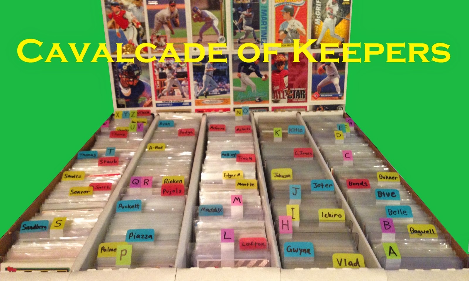
I'm not just building the ultimate Griffey collection - I'm also a casual set-builder.  Here is a continuously-updated list of sets I am working on and the cards I need to complete them.  E-mail me at thejuniorjunkie at gmail dot com and let's trade!

Note: I'll try and update this list with names to go with card numbers when I have time (I'll never have time).

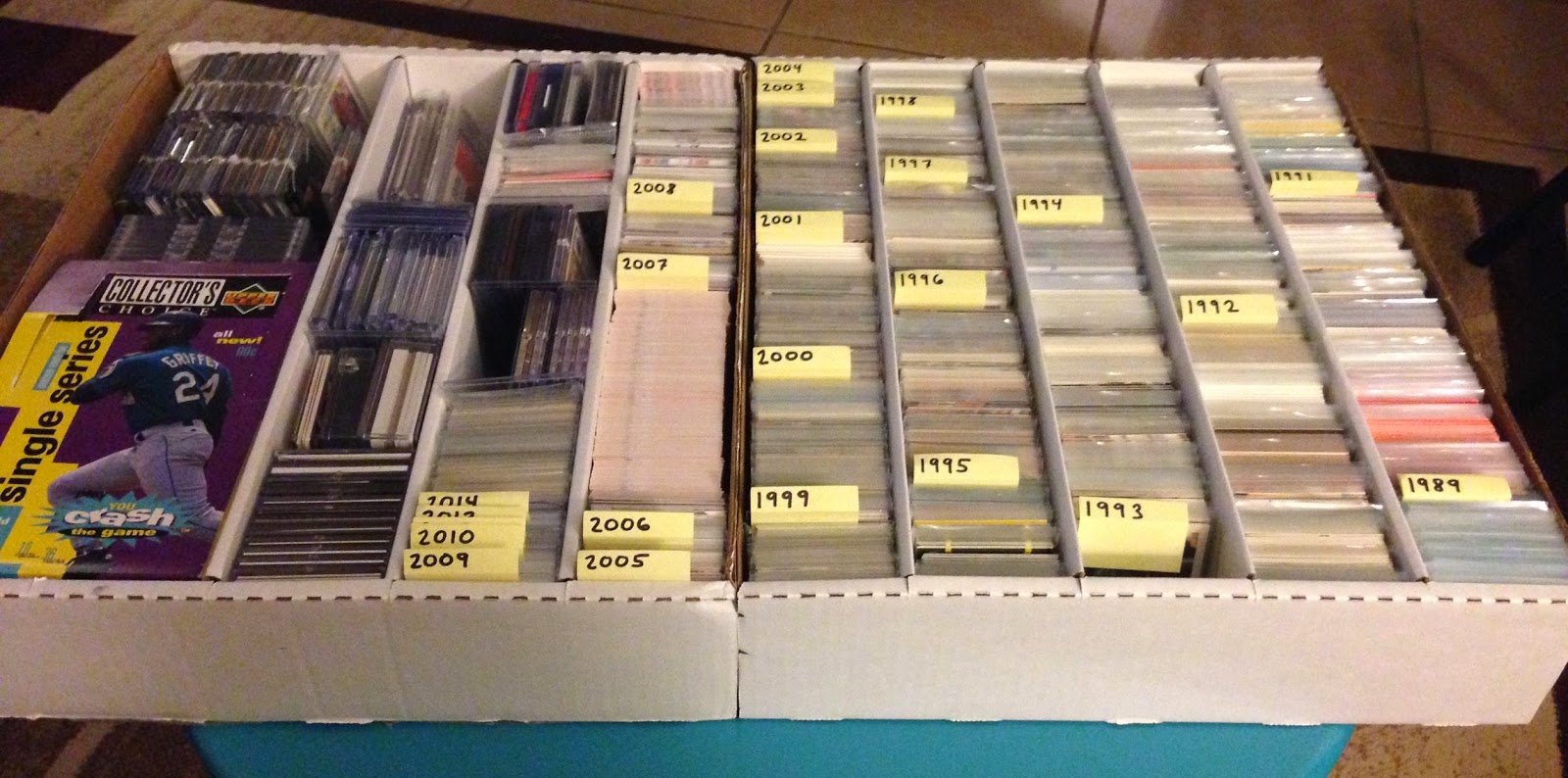
Lists are current as of 11.5.14

1989 Donruss (perpetual):

Current Needs:
42
70
154
171
182
183
189
291
298
299
317
323
472
589
BC-7

1990 Topps Kay Bee Kings:

#18 Don Mattingly
#23 Kirby Puckett

1991 Studio:

236 Jose Oquendo
217 Roger McDowell
199 Bill Sampen
167 Barry Larkin
149 John Smoltz
98 Hensley Meulens
77 Franklin Stubbs

1992 Donruss:

7, 152, 157, 336, 382, 388, 405, 408, 409, 416, 425, 428, 446, 458, 461, 467, 474, 498, 505, 510, 512, 517, 522, 528, 533, 535, 540, 542, 547, 549, 553, 555, 558, 560, 563, 565, 567, 572, 574, 575, 579, 581, 585, 586, 587, 591, 593, 594, 600, 601, 603, 607, 612, 617, 619, 623, 614, 626, 631, 633, 636, 637, 639, 641, 644, 647, 652, 654, 657, 661, 664, 668, 675, 677, 683, 688, 689, 695, 698, 719, 728, 730, 733, 737, 738, 742, 753, 784

Bonus Cards: BC2, BC5, BC6
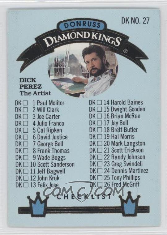
All Diamond Kings except #2, 3, 4, 11, 12, 17, 19, 22, 24, 27

1992 Studio:

1, 12, 16, 20, 21, 29, 31, 38, 39, 45, 48, 49, 54, 59, 64, 69, 73, 84, 93, 94, 98, 104, 113, 114, 118, 134, 141, 151, 161, 169, 171, 178, 179, 189, 194, 199, 204, 209, 214, 224, 234, 243, 244, 248, 262

Heritage Insert: all except BC-2, 3, 6, 7

1995 Upper Deck:

244 Carlos Perez
245 Brad Clontz
246 Steve Rodriguez
248 Ozzie Timmons
259 Dilson Torres
271 Mark Langston
361 Pete Harnisch
451-495 all

1996 Metal Universe:

Note: Numbers in bold are cards for which I have the Platinum parallel.  These are available in an even swap for their respective common base cards.  E-mail me for details.

2, 4, 7, 8, 16, 29, 30, 31, 32, 41, 54, 55, 57, 61, 66, 69, 71, 74, 79, 80, 81, 82, 83, 90, 91, 94, 95, 100, 104, 119, 126, 130, 140, 142, 145, 147, 151, 153, 154, 157, 158, 164, 168, 177, 190, 194, 203, 207, 210, 212, 214, 221, 224, 226, 228, 231, 233, 234, 236, 237, 238, 240, 247

1997 Metal Universe:

3, 10, 37, 38, 46, 51, 52, 85, 107, 114, 157, 180, 185, 191, 216, 221, 241

2013 Topps Update:

40, 46, 50, 87, 99, 100, 120, 133, 136, 138, 150, 168, 237, 264, 267, 313, 321, 326, 330

2014 Topps Series 2:

333, 345, 348, 360, 361, 387, 432, 454, 463, 475, 477, 487, 494, 504, 505, 507, 509, 513, 520, 533, 538, 548, 566, 574, 576, 580, 586, 595, 598, 614, 615, 633, 648, 653, 657

2014 Topps Stadium Club:

2, 5, 6, 8, 10, 11, 12, 13, 16, 19, 24, 27, 29, 30, 31, 34, 36, 38, 39, 41, 44, 46, 51, 52, 56, 57, 58, 59, 60, 61, 64, 66, 68, 69, 70, 71, 75, 79, 82, 83, 84, 85, 86, 89, 91, 92, 93, 95, 97, 98, 100, 101, 103, 104, 107, 109, 113, 120, 121, 122, 124, 126, 129, 130, 131, 135, 142, 144, 145, 146, 148, 153, 158, 160, 161, 166, 167, 170, 173, 176, 182, 184, 185, 188, 189, 191, 192, 194

And all the Field Access cards...

________________________________________________________________________


Completed Sets:

1982 Fleer
1983 Sunbeam Bread LSU Tiger Greats
1984 Topps
1986 Donruss
1987 Bellingham Mariners Team Set
1987 Hygrade Baseball's All-Time Greats
1987 Topps Baseball Highlights Glossy Collector Series
1988 Donruss Ltd. Holiday Edition
1988 Score
1988 Topps
1988 Topps Toys R Us Collector's Edition
1989 Bowman
1989 Donruss
1989 Donruss The Rookies
1989 Donruss Puzzle: Warren Spahn
1989 Fleer
1989 Score Scoremasters
1989 Score Young Superstars Set 1 & 2
1989 Topps
1989 Topps KayBee Superstars of Baseball
1989 Topps Kmart Dream Team
1989 Topps Traded Tiffany
1989 Upper Deck
1990 Bowman
1990 Fleer Baseball All-Stars
1990 LSU Collegiate Collection
1990 Topps
1990 Topps Traded
1990 Upper Deck
1991 Donruss
1991 O-Pee-Chee Premier
1991 Topps Micro
1991 Upper Deck
1991 Upper Deck Final Edition
1992 Score Proctor & Gamble All-Star Game Set
1992 Score Superstars
1993 Classic Pro Line Live New Orleans Saints Team Set
1993 Fleer
1993 Fleer First Edition
1993 New Orleans Saintsations Dance Team Card Set
1993 Skybox Star Trek Master Series
1993 Studio
1994 Upper Deck Ken Burns' Baseball: The American Epic
1995 Best Tops 100 Players
1995 Leaf
1995 National Packtime Redemption Set
1995 Star Cal Ripken, Jr. Commemorative 2,131 Games Record Collector Set
1996 Upper Deck Predictor Redemption Set
2002 New Orleans Zephyrs Team Set
2007 New Orleans Zephyrs Team Set
2007 Topps
2008 St. Paul Saints Team Set
2012 Topps U.S. Olympic Team
2013 Topps
2014 New Orleans Zephyrs Team Set
2014 Topps Series 1
2014 Topps Finest

Official Griffey Wantlist


This is a perpetually updated list of specific Griffeys I'm looking for.  If you have any of these you would part with, e-mail me at thejuniorjunkie at gmail dot com and let's trade.  Thanks for looking!

First, I need any Griffey not on THIS LIST.

1994 Dairy Queen Gold Border Set:
3
4
5
7
8
9

2007 Upper Deck Ken Griffey, Jr. Chronicles:
1-5
7-13
15
18-20
22-27
30-46
48-50

2008 SPx Ken Griffey, Jr. American Hero Insert:
KG7
KG10
KG15
KG16
KG22
KG26
KG30
KG39
KG44
KG54
KG60
KG68
KG81
KG82
KG99
KG100

Griffey cards done in the Topps base set design from the following years:
1962
1967
1973
1976
1977
1978
1979
1981
1983
1984
1986

Also:

1989 Upper Deck #1 Slabbed BGS10
1990 Fleer #514 Canadian Version
1990 Leaf Preview #4
1994 Upper Deck Griffey/Mantle Dual Auto /1000
1995 Leaf Statistical Standouts #2 #/5000
1997 E-X2000 A Cut Above #2
1997 Upper Deck Game Jersey #GJ1

And I'm always interested in:

Any Griffey 1/1
Any card featuring signatures from both Junior and Senior
Any Collector's Choice Gold Signature
Any Finest Refractors
Any Oddballs

Thanks again for looking!

A Box of 1996 Fleer Metal Universe


I have strange taste in cardboard.

Since I started collecting again I’ve been setting aside every ’96 and ’97 Metal Universe card I come across in a separate mini-box I labeled “Metal.” I could never put my finger on exactly why I was doing this until recently when it dawned on me that I could – nay, must– take a shot at building the set. It’s just so creative and cartoony and fun. There’s never been another brand like it.

Now, I’ve already written a post about these, so this post is more about the box break as opposed to the set as a whole.

Without further ado, let’s look at some sweet, sweet box booty from 1996!


A nice cross-section of inserts here, including the coolest of them all, the hobby-only Mother Lode insert. It looks nothing like the rest which are essentially just flat, metallic cards that are kind of dull by any standards. Mother Lode has cool designs in holofoil that are striking against the stark white.


The Platinum parallel is kind of dull, too. I get what they were going for in that it’s all about the texturing of the foil here, and in the absence of coloration you can really make out all the etched detail; but overall it’s still kinda boring. I’d have preferred another regular base card in each pack instead of these.


And, of course, there were a bunch of these...things.

Let’s get to the heart of this set’s appeal: the super kick-ass base cards.


These are just a few pages from the shiny new set binder.  This set does not scan well.  For a better look at some great Metal Universe base cards, see my original post.

I got 154 base cards from this box. Of those, zero were duplicates. Zero! Thank goodness for that, too, because that’s a small portion of the base set for a box that has so few cards in it.

The base set consists of 250 total cards, so the box put me at just over 61% completion. I still need a bunch of them, though. I already landed a handful on Just Commons. If anyone out there has any of my needs I’d repay them handsomely.

I’m also making a standing offer here and now: anyone out there who has the regular version of a base card I need, I will swap out my Platinum parallel version (assuming I have it) of the same card for nothing. Just send it via PWE, and I will do the same.

For the complete list of cards I need from 1996 Metal Universe and other sets, please see my Set-Building Needs. My list of Platinum parallel versions for trade for their common versions is also there.

And like the noble Native Americans would use every part of the buffalo, I used every part of the box.  First, I cut out the Metal Universe logo and used it to label the spine of the set binder:


Then I cut out that cool Manny Ramirez card from the front of the box which is indistinguishable from the real base card apart from the blank back:


It belongs in the binder, and I can cut cards out like an adult now.

Coming soon: a Box of 1997 Fleer Metal Universe.  Thanks for reading!

Beacoup Choses de la Belle France, Kevinsent

Image may be NSFW.
Clik here to view.
My dog just had surgery, and I didn't have the heart to cut her out of this picture.

Jackpot!

Kevin of the great new blog The Card Papoy (which, incidentally, has some of my favorite post titles around), lives in France.  Unfortunately for him he is also a baseball fan, specifically the Blue Jays.  I offered to send him a bunch of Jays I have laying around in exchange for some yummy French stuff.  As for what he could send me in return, I gave the examples of chocolate, cheese, and mustard.  Well, Kevin sent all three in a big box with some sweet cards to boot.

But before we get to the cards, let's talk about the food.  The cheese is soft but strong-tasting, a tiny bit salty but a lot more sweet with a lot of that roof-of-the-mouth stinging goodness.  The chocolates are smooth and completely unlike what I buy here (mostly Russell Stover or Lindt's if I'm feeling saucy).  More soft and melty in the mouth than what I'm used to.  I'm trying to take my time eating them.  The mustards I have not gotten into yet, but I am super excited about the different flavors there.  Great stuff, all.

Okay, this is not a food blog:


Kevin has a good eye for fun and unique cardboard.  He also seems to love Stadium Club which I can relate to.  Whoever down at the Topps offices chose that picture for Erik Pappas is a sick man, but I love the brazen resolve on Tim Naehring's face that says "Watch your ass, umpire - I'm getting this bastard out."


It's amazing to me how many baseball cards feature a football.  It makes sense what with the slight overlap of the seasons and the fact that many of these guys must have played football in high school (apparently Rangers prospect Russell Wilson is also a footballer of some kind.  Isn't that wild?).  The BJ Birdy is one of my favorite cards from this package.


We are the Pelicans now, formerly the Hornets.  I really wish we had the name Jazz back.  It was pretty perfect.

Thanks for the card, Monsieur Kevin!  I'm already stockpiling Blue Jays for you, but if there's any American food I can send you (McGriddles?) I'd be happy to oblige.  I do live in New Orleans where we have access to some excellent sauces and spices.

Vive la France!

1992 Donruss: Overproduced and Underappreciated


Old sets are right in my wheelhouse, but this post took a while to put together for one simple reason: I want everyone to like this set as much as I do.  Massively overproduced as it was, '92 Donruss is a gem of the early 90's, especially when you look at it in the context of the Donruss designs that preceded it.  This was a brand trying to reinvent itself, and this was meant to be the set that laid the groundwork.

It’s hard to tell whether Donruss' fundamental design change happened in reaction to Upper Deck’s success or if it happened organically. Donruss was 12 years into the card business, after all, and its clients were growing up. What we see in 1992 is a more mature product and design than ever before. Clean lines, limited colors, and high-end paper stock brought an air of maturity and worldliness. Donruss had gotten its pubes, and it was time to show them off.

Whether the change can be attributed directly to Upper Deck’s success is up for debate. At this point everybody was moving to higher-quality white paper stock and two-sided, full-color printing. In my opinion, these were upgrades that were long overdue anyway, and improvements in printing allowed for better quality cards to be made at lower cost. Cards like this were inevitable.  You can't put it all on Upper Deck.

The design itself is dominated by a horizontal strip of light blue along the top and bottom of the card with the player name in a thick, heavily-shadowed font along the bottom. The letters are a prominent matte silver that resembles the part of a scratch-off you rub with a coin. I’m not normally crazy about monochromatic designs (’91 Fleer, ’90 Donruss, ‘01 Topps to name a few), but that blue is just muted enough to not be inappropriate for all teams.

The cards are advertised as glossy, but it’s funny what was considered glossy in 1992 considering ’93 Flair which featured what may be the glossiest surface ever created by science came out just a year later and glossed everyone’s eyes out. I will say that ’92 Donruss is smooth and sharp - there is definitely quality here.

The Donruss logo is different this year, too, in that it isn’t there at all - just the year and brand written in tastefully spaced-out letters along the top banner. I like to think this was meant to class up the design and signal Donruss’ transformation into a more modern look.

That quality extends to more than just the cards themselves: the photography in this set is some of the best Donruss ever had. I didn’t really know this until recently when I happened upon a pair of boxes, one from each series, priced at five bucks each from my LCS. The quantity of great shots I came across while flipping through those packs blew my mind. Here are a few from that stack I set aside just for this post:
Image may be NSFW.
Clik here to view.
Awesome action
Image may be NSFW.
Clik here to view.
Bonkers batting
Image may be NSFW.
Clik here to view.
Harrowing hitting
Image may be NSFW.
Clik here to view.
Captivating catching
Image may be NSFW.
Clik here to view.
Precocious pitching
Image may be NSFW.
Clik here to view.
And a whole lot of ragin' Rated Rookies

This is some solid photography, guys, even by today's standards; and the Rated Rookie portraits are everything I wish they had been back in ’89. I guess I always overlooked the photography in this brand because it’s right in the middle of the overproduction era. Never again. Donruss’ attempt at self-improvement is a hit with me.

Nothing signals the change Donruss was going through more than their new card back. There’s a lot going on here, so let’s look at a side-by-side comparison with the back of the previous year’s base set:


At first glance it’s like night and day, right? Look again. Notice that every aspect of the previous card back has been feng-shui’d into the new design, including Donruss-only favorites like the full name and contract status. No other brand took their modernization this far and with this much detail. In that respect this is arguably the greatest card back Donruss ever produced.

And did I mention the massive, full-color portrait that fades into the stat box? Did I need to?

After this year the full player name would disappear from the card backs, and the contract status would stick around for one more set only to be completely done away with by ’94. The only part that would stay is the stat box and player details, but with all the fun exclusives gone there was no comparative advantage left to set Donruss apart.  They gave up a little bit of their identity each year after this.  To me, '92 is the last true Donruss set.

OK, let’s get down and dirty:

Image may be NSFW.
Clik here to view.
1992 Donruss #165

Here’s a bright, sunny day game shot. Looks like a ground ball to second almost certainly sneaking by some unsuspecting infielders into right center. That’s just how Junior rolls.

Lucky for us they still had the full player name this year. I wish Donruss hadn’t missed the boat on including Chipper Jones in this set – the whole Larry thing would have blown my 11-year-old mind.

Image may be NSFW.
Clik here to view.
1992 Donruss #24 All-Star

I’ve been praising this set a lot, but Junior’s all-star card feels awkwardly-framed, badly-lit, and you can barely see his face (though what you can see is showing some mad focus, y'all). It looks like they were going for the candid action shot of Junior taking a lead off the bag, an idea that is much better-executed on other cards in the set.

Donruss went hard into the promotional market this year, making for some sweet branded oddballs. Check it:

Image may be NSFW.
Clik here to view.
1992 Donruss McDonald's MVP #22

This McDonald’s MVP card has a great action pic featuring the Kid maintaining a concentrated gaze despite being in a very compromised position balance-wise. In addition to having a superior photo compared with both Griffey base cards, the unique matte gold lettering instead of silver and an MVP logo that is not ostentatious about its fast food pedigree make this a pretty solid oddball. I’m lovin’ it.

Image may be NSFW.
Clik here to view.
1992 Donruss Cracker Jack Mini #12


Mickey D's wasn't the only company to get in on the baseball card craze with Donruss.  These Cracker Jack minis are actually really high-quality with designs kept as faithful as possible to the regular base design for being so tiny.  They feature a different photo than the original base card and a reasonably functional back tailor-made for smallness.

Image may be NSFW.
Clik here to view.
1992 Donruss Cracker Jack Mini Wrappers

“Toy Surprise.” Surprise! It’s not a toy – it’s a card. Cards aren’t toys; but thank you, Cracker Jack marketing department, for getting with Donruss and making these cool little things happen.


While the cards inside are identical, you’re better believe that different wrapper is a variant.

The Diamond King for the Mariners this year went to Randy Johnson. I like the Big Unit, so I’m not going to besmirch this choice (cough, All-Star Game MVP, ahem), but there is one card from the Diamond Kings insert that needs to be shown:


Yes, this is lifted from COMC.  Mine is filed away, and I don't feel like digging it out at this moment.  You get the idea...

There he is: Dick Perez himself. DP is a legend in the card collecting community for his polarizing player art. From the majorly tripped-out backgrounds of 80’s and 90’s Donruss to the questionable-at-best blotchiness of 2006 Allen & Ginter Dick Perez Collection zombie Griffey, we all have some kind of opinion of Mr. Perez. Like him or not, his work is fun to talk about.

Image may be NSFW.
Clik here to view.
One of the better generations of DK designs, though the checklist
could use some tweaking

Diamond Kings inserts appeared in boxes at around four hits per (though I managed to pull five from one box). Still, imagine being a kid and saving up your allowance for weeks until you finally have enough for an entire box of ’92 blue only to pull a DK checklist featuring Dick Perez’ bearded mug. I would have thrown a major hissy, but as an adult I cherish that card.

I should go ahead and mention here a common mistake made among collectors:


See this? The back of this card indicates it is from 1992, but this is really the Diamond King from the 1993 Donruss base set. The closest to a Diamond Kings insert Griffey got in ’92 was the Gallery of Heroes from Triple Play. I, too, am guilty of this mistake. You can’t always count on the copyright year (especially with Collector’s Choice and mid-90’s Score). Griffey collectors, update your checklists.

Oh, and this year's Donruss set featured a Rod Carew Puzzle.  Yes, I have the whole thing, but I won't be showing it here as that would entail me popping out the little pieces and putting the thing together, then finding a way to store said assembled puzzle.  All respect to Mr. Carew, but no thank you.

Here are the Griffeys I need from 1992 Donruss:

Promo #7
Elite #13 #/10,000
Leaf Preview #24

The stated odds of that Elite insert give something remarkable away about this set (and other sets from this period). At 10,000 copies of each of ten Elite Series cards plus 7,500 of the Rickey Henderson multiplied by stated odds of one Elite card per 55 boxes (according to Baseballcardpedia), we can extrapolate the number of boxes of this product to be 5,912,500. That's a hair shy of 3 B-B-Billion cards.  This is the bottom number as it’s not clear whether those odds include jumbos. There could be considerably more.

Let’s take this even further: Each card is 3.5” at its longest point. At 504 cards per box, that’s 1,764 inches of card per box which totals 10,429,650,000”. The Equator measures 1,558,010,995.2 inches around. This means you can lay out all the 1992 Donruss cards ever produced end-to-end around the world almost seven times. That’s just one set from the overproduction era. I think this may have a little to do with why some people hate ’92 Donruss. There’s far too much of it on this planet. Remember that stat next time you feel guilty about throwing away a bunch of junk wax.

Then again, the more you throw away, the more my ’92 Donruss cards are worth.

Thanks for reading!  Coming soon: two boxes of 1992 Donruss Series 1 and 2.

He Made Me an Offer I Couldn't Refuse


Say hello to my latest and greatest acquisition: the 2012 Topps Gold Team Coin Autograph #GTC-KGJ #/30.  It's an excellent specimen of on-card autography, bright and shiny, rich in color, and larger than life.

You may have noticed it includes a heavy gold coin embedded right into the card.  At first I thought the coin may just be foil-stamped paper or aluminum (which is how they make Mardi Gras doubloons), bu this thing is a real heavy metal of some kind.  It's a very impressive card.


The card was originally won by Jason of the now-extinct Joe Average Card Collector.  You can still see the post he did when he won this baby here.  I commented on it back then with great jelliness.  Jason contacted me recently in need of some funds for an amazing baseball-related experience, and he sold it to me for far less than I would otherwise ever hope to get it for.

I don't want to overstep my bounds, but here's a picture Jason sent me of him sitting with the owner of his heritage team, the Colorado Rockies:


That's awesome, bro.  I'm glad I was able to help make that happen.  We miss you, Jason!  Thanks for the amazing deal!

Breaking the Seal(s)


Careful - this post may hurt.

"Breaking the seal" usually refers to the first pee after you start a night of drinking.  It usually feels amazing and leads to future pees that happen far more frequently than before the "seal" was broken.

This term used in terms of card collecting means something much more painful.

I have a lot of Griffey rookies, and until recently I had almost every one.  Almost.  The one official Griffey rookie that eluded me was the 1989 Topps Traded #41T Tiffany.  You probably know about Tiffany cards if you've ever actively collected - they're re the super-glossy versions of Topps, Bowman, and Fleer sets from the 80's and 90's printed on white card stock in very limited quantities.

Now, with the Traded set which is already printed on white card stock the only characteristic that differentiates a Tiffany card from the regular version is the gloss coating which can be difficult to spot on a card that is encased.  For this reason I've actually been through a couple of duds purchased online (Tiffany cards are tough to buy online because you can't verify them).  The way I figured, the only way I was going to land a true Tiffany 41T with absolute confidence was to buy the sealed set, so I did just that.

The set arrived, and it sat in my Griffey cupboard for weeks before I decided it was time...to break the seal.


It hurt to do, but I wanted my Griffey, guys.  I wanted my Griffey.


And there it was, perfectly cut and shiny as the day the Good Lord made it.  The thing was more valuable with that little gold sticker intact, but this card is 95% of the value of the set, anyway.  Plus, I got these:


A pair of nice PC cards, and....


All these to boot!  Looking back I would do it again, and I have to admit that yes, I have mixed feeling about it; but I feel glad that the cards within are being enjoyed by me and anyone cool enough to read this blog.

And yet, I should admit here that on that fateful night, after dispatching the virtue of that little '89 Tiffany Traded set, I got what you may call a bit of a seal-breaker's high.


Here is a sealed 1987 Bellingham Mariners Team Set.


As you can see on the back here, Mr. Griffey appears on two cards: #15 and #33 which is this very checklist.  There is a team photo on the other side.  Know how I know?


That's right - I did it again.


What an amazing card!  Is it wrong that this card will no longer be sentenced to an eternity facing the back of card #14 Wade Taylor?  No!  This belongs scanned and on the Internet for all to enjoy, then secured in a nice, clean screw case where its edges may remain ever sharp.  It's real nice, too.  A little off-center, but otherwise perfect.


There were also a handful of other fun cards I wasn't aware of when I bought the team set, a pair of funny names and two little kids of whom I'm not totally jealous.  I'm not.

I have a few other items I haven't broken the seal on, those being a 1993 Stadium Club Master Photo jumbo set (the Griffey is stuck between two other cards),  a bunch of small sets with Griffeys I already own loose, and a few Starting Lineup figures with cards in the blister packs.  I'll probably leave most of those intact for now; but if there's a card I need for the collection with a layer of thin plastic between it and me, I'm not above breaking said plastic.

Actually, those Starting Lineup figures might not even last the day.

Cavalcade of Keepers 5


Time for some more gems from the Keeper Box.


I love Josh Gibson cards.  This one is particularly nice with Josh glowing eerily in the foreground and an amazing stadium backdrop.  Something must have been tweaked to make him appear as in-focus as he is because the background is nowhere near that clear.  This guy should be a household name.


While I'm not an active collector of Mr. Larkin's cards, I have no excuse not to be.  He's a class act and has a ton of amazing cardboard out there.  This one from Topps Gallery shows him hovering in mid-air in the midst of turning a double play.  Just a great photo from a consistently photogenic player.

Note: I have two extras if anyone needs one.  First dibs to the known Reds collectors, but I'd be surprised if you guys don't already have this one.


There are two things I love when it comes to cards: Topps Gallery, and Stadium backgrounds.  Here's both.  Eric looks ten feet tall.


Javy is giving it his all in this Ultra offering, and really it could not have been framed better.  Oh, and it's a Tatooine card.  Who is it that collects those?  I've been setting them aside and have no idea who to send them to.  Anyway, go, J-Lo!


I have a bunch of Rickey Henderson cards featuring him sliding into one base or another (they were popping up everywhere in the 90's as he approached Brock's record), but this is by far my favorite.  He's cool and collected here, suspended in air as he slams into third.  I know it's subtle, but the ump watching him from the background makes this card.  Rickey did his part, too, I guess.

Thanks for reading!
Viewing all 357 articles
Browse latest View live