Quantcast
Channel: The Junior Junkie: the Baseball Cards of Ken Griffey, Jr. and Beyond
Viewing all 357 articles
Browse latest View live

Design Timeline: O-Pee-Chee

$
0
0
This post is part of an ongoing feature The Great Griffey Base Card Project.

O-Pee-Chee is a candy and gum company that started making collector cards back in the 1930’s then baseball cards in 1965 through a deal with Topps. At first their cards were indistinguishable from the Topps versions in every way apart from one small aspect: “Printed in USA” was replaced by “Printed in Canada” on the back next to T.C.G. That’s it. Everything else was identical.

This changed over time; and while the cards remained more or less the same, logos were added as well as a little French in lieu of English for the Quebecois. Tres exotique, non? This made for more cards to chase which was a big deal in a time when there was only Topps and maybe a few branded oddballs. Even when Donruss and Fleer came along in 1981, there was still very little for card-crazy completionists to go after. O-Pee-Chee provided collectors with a whole base set of new trophies. Sadly, as with numerous other baseball card brands, it didn’t last.

Some quick trivia before we begin: According to Wikipedia, “O-Pee-Chee” is an aboriginal word meaning “the robin.” It was also the name of the summer cottage of one of the company’s founders. I’ve been wondering what the deal was with that name for 20 years. Boom: knowledge is power.

Here is every Griffey-wielding O-Pee-Chee base card design in order:

1990:

1990 O-Pee-Chee #336

As you can see there is no difference here compared with the regular Topps base card. Same bright colors, same wacky Buttafuoco-pants border – it’s identical. The card is printed on lighter card stock the way Traded and Tiffany cards were (but not quite as white), so the back is lighter here than the regular. That makes them easy to spot in a stack.

I’ve already done the Timeline for the Topps designs OPC uses through 1992, so I won’t go into the designs too much until the 1993 set - just the differences.

1991:

1991 O-Pee-Chee #790

Again, no difference between O-Pee-Chee and Topps on the front and a lighter brown card stock evident on the back. They even kept the massive but totally sweet 40th Anniversary Topps logo. There are more versions of this ’91 card than any other design on this timeline. Apart from the regular base card, there’s the OPC, Tiffany, Desert Shield, Micro, Cracker Jack, and uncut Cracker Jack versions. I’m probably forgetting some, too.

1992:

1992 O-Pee-Chee #50

For the first time since the 80’s we have an honest-to-goodness OPC logo in the place of the Topps logo here. That little detail made these a heck of a lot easier to spot. Apart from that, no differences here. Even the card stock is identical (finally).

I really hope you enjoyed the first half of the timeline, guys. After all, the real gems of OPC in my opinion have always been their slightly funky versions of the same Topps cards we’d seen a million times before but with a wild new name/logo and strange French verbiage. They’re fun, right?

Great. Well, say goodbye to that. Their contract with Topps came to an end and was not renewed for 1993. This means the remaining sets are all original designs, and without the Topps clout behind them they sorta skirt the line between bonafide base card and overproduced oddball.

1993:

1993 O-Pee-Chee #91

Here is O-Pee-Chee’s first original flagship design in 28 years. I don’t remember opening packs of this or seeing it around card shops or anything. I only dealt with this set when I started amassing Griffeys. I genuinely thought it was an oddball at first. So many 90’s oddballs have that washed out look you know?

Anyway, the bold team name up top doesn’t really match the understated nameplate. The best part of this design to me is the O-Pee-Chee logo in the little team-colored diamond. Overall, none of the elements here complement each other very well, and they’re all imprisoned together by that oppressive white border. I like weird stuff, guys, but I cannot get behind this one.

1994:

1994 O-Pee-Chee #22

The last independently-O-Pee-Chee flagship design, this one is actually not too bad. All the design elements have chemistry here unlike those of the previous year. No more full border, nice use of team-color and superimposition of the photography, and there’s even French on the back and front. It feels like a real set. The modernized logo I could live without, but overall this is not too shabby.

O-Pee-Chee ceased baseball card production after ’94 due to the MLB strike, and after being bounced around between card and candy companies for a while, the brand finally ended up belonging to Upper Deck. During this baseball card blackout of theirs they were prolific in the Hockey card market (which they still are) under their new owners. Only one more O-Pee-Chee baseball base set would be produced...15 years later:

2009:

2009 O-Pee-Chee #425

This is Upper Deck’s version of the classic brand, and as a whole the set is pretty solid. Upper Deck missed a fun opportunity to sneak a little French on the card back as a gesture to OPC's history, but this is probably for the best as I doubt many people would have gotten the joke. The photography is really good and the cards are colorful and attractive. They even went with the original logo over the one from ’94. Check out the little baseball position indicator – so throwback.

And that’s pretty much where it ends on the baseball front. The brand poked its head out a few other times with a trio of allegedly-higher-end “Premier” sets and a 1969 reprint insert from 2008 Upper Deck, but apart from those they were barely around at all after ’92. It just kind of went away. I assume somebody in Quebec was pissed.

______________________________________________________________

There are not many mourners for this set save for the few old school guys endeared to the brand by having a few extra cards to chase in the days before inserts and parallels. The independently-O-Pee-Chee designs seem all but forgotten.

The brand remains under the ownership of Upper Deck, meaning our odds of seeing new baseball cards from this set are zilch to nada, for now, anyway. There was never much substance to the cards to begin with, so any rehashing of O-Pee-Chee would be gimmicky and totally unnecessary. I don’t feel like we’re missing much.

Wait, wait – I just made up an O-Pee-Chee joke.  Ready?

What has four corners and “pee” in the middle?
.
.
.
.
…wait for it…
.
.
.
.
A square toilet.

Sorry.  Once more, here is every Griffey O-Pee-Chee base card in order:


I Got Zippy Zapped (and I Liked it)

$
0
0
I got a mysterious package in the mail from someone with very tiny handwriting in their return address. I proceeded to experience a Tyler Durden moment as I opened the package and inside was a halved bubble mailer with Mariners logos drawn in my own hand.I had drawn on this package. What kind of sorcery was this!?!

The fear gave way to relief and excitement as I pulled out the flat item within and found a pack wrapper around a stack of cards with a note that read “You’ve been Zippy Zapped.” I’ve read about these ZZ surprise mailings on the blogsphere, and now there was one for yours truly.


I was also super excited to get that wrapper open because I know (as do many of you other bloggers) that Zippy Zappy has Sega Card-Gen. I’ve never even see one of these exotic beauties in person let alone owned one, but now…


YES! It’s probably for the best that I was home alone at this point because I would not want my wife to see me lose my shit over a little cardboard picture of a dude, and that’s precisely what happened. I’ve scoured the Interwebs looking for this card but could never find one.

Card-Gen are special. It is said they cannot be bought – only given.


These were also in the pack, protecting the lovely Card-Gen specimen from the potential bends and bruises of the U.S. Postal Service. That’s Dan Wilson on a late-model Stadium Club design, two great tastes that taste great together.


A million thanks, Mr. Z, for your generosity. This is what the blogsphere is all about, and it keeps getting proven over and over again. I’m inspired to get off my ass and mail out a bunch of trade packages (the fodder is piling up).

By the way, Zippy Zappy runs Cervin' Up Cards - add it to your blogroll!

Royals

$
0
0
This is one of the funniest damn things I've ever seen.  Geaux Royals.


A Box of 1992 Studio. Oh, and a Samurai Sword.

$
0
0

This sophomoric effort from the Studio team is arguably their best. Lessons were learned and improvements made after the hokey-but-amazing 1991 release.  Let’s be honest - it could be argued by some not quite as enamored with that inaugural design as I am that it was maybe a little “dry,” even by early-90’s standards. The good news is that all the characteristics that changed for the 1992 design were very much for the better.

The obvious changes this year are the border and the backdrop. The strange mauve-ish hue that defined the ’91 set was replaced by a dark gold that wouldn't conflict with any team colors, a fact that would have been more relevant had they kept the logos in the design. Still, it does look better.

The backdrop was also changed from generic photography studio drop cloth to black-and-white action shots shown in a grainy filter. I’m certain these backgrounds would have looked better sans-filter, but they also would have taken attention away from the portraits in the foreground which, after all, are the intended focus of the set.

The original set was released under the Donruss banner, but as indicated on the '92 box and pack wrappers, Studio was now touted as a Leaf product. This was the same year Donruss was actively trying to boost the perceived quality of their flagship set. It seems the marketeers were trying to lend Studio a certain level of sophistication that the Leaf brand already had and Donruss decidedly didn't (especially after that 1990 set – yeesh).

A few other tweaks include full-color portraits, the color Studio logo (remember how big teal was in the early 90’s?), and the classy Times New Roman font and italics in the nameplate lettering. It’s a very grown-up set. I even flipped through these cards with my pinky up.

Now, let’s look at 27 guys who put the “stud” in Studio (did I really just type that?):


Does Cal Ripken even know how to take a bad picture? Somebody send me a Cal card with a bad picture. Seriously – I want to hold it in my hands; otherwise it didn’t happen.

Speaking of Cal:


A welcome addition to Studio this year was the Heritage insert which features notable players in throwback uniforms. The box gave five of these (two Strawberries), including the Ripken which is arguably the best of them all. One of my favorite inserts of the 90’s.


Luckily a lot of my PC's played in '92, and three Griffeys came out of the box which far outpaced the single Griffey I got from the '91 box a few months back.  Fantastic.


Studio brought back using the checklists to honor non-active players.  Last year it was coaches, but this year we got Hall of Famers. Great shots, though Billy looks like he's hitting on me.


This title card was inserted into packs for '92 while in '91 it was only available with preview cards from factory sets of '91 Donruss. All things being equal I'd rather have an extra player card, but at least it's one less card I have to chase.

Okay, now that the business is done, we can get down to the pleasure – the real fun of early-90’s Studio cards: those zany, awkward, spooky, nerdy, towel-rocking, perfectly-coiffed, not-so-perfectly coiffed, bespectacled, frightening, sword-wielding, eye-killing, face-melting portraits!


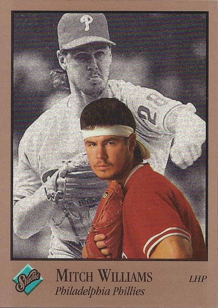
One of my favorite cards in the set, period.  Mitch rocks the headband the same way every other white guy rocks the headband - poorly.  The mushroom of hair on top makes his head resemble a cupcake or a way-too-full plate of manure.  Leave the headbands to Ralph Macchio, Mitch.


I love Mike LaValliere almost as much as I love pictures of Mike LaValliere.  I would love to have been a fly on the wall at the strip club after a road win with that guy.  You just know he raged like a juggernaut.

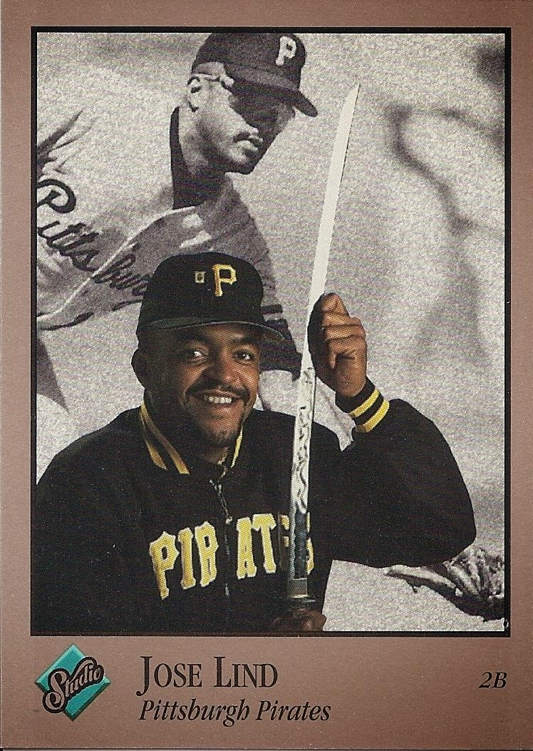
Jose's bicep is fun, but this card would have been a lot more fun had he not been smiling a la Ricky Bottalico's infamous "check out my huge guns" Collector's Choice card.  At least Jose is cool about it.

I threw Finley's card in here to show that he can, indeed, look human,  He won scariest card in my post about the '91 set, but here he just looks like a regular dude.  Skinny, but regular, and definitely not a zombie.


Neither of these is a studio shot.  I assuming Deion couldn't make it to the shoot that day because he was playing another sport professionally.  And Clemens was probably somewhere lying under oath. 


A pair of photography errors which are rare for Studio.  Lee Smith is cropped way too high and Ron Gant is horribly-lit.  I'm thinking there's a good explanation for both of these.  Maybe Gant had a  pimple, and Smith wore a Topps shirt.


I included this card here because of that goofy pose, but upon closer inspection the joke becomes clear.  Possibly my favorite Rex Hudler card ever.


So the purpose of that shirt on Plantier is that you don't see it under the uniform, right?  It's kind of a function-over-fashion thing?  He looks like a '60's scifi future guy. And I can just imagine Royce Clayton on the phone with the Studio people asking, "Hey, cool if I wear my Jam top?" It's the only instance of airbrushed Beefy-T I've found in Studio so far.


You've got to hand it to Sabo - he's really sticking with those rec specs.  From Dick Perez paintings to these Studio portraits, he doesn't take them off.  You've got to respect it.

Dibble on the other hand is Dibbling all over the damn place.  Frickin' Dibble, man.

Okay, time to hand out some awards.

Best Hair:


Helmets, flat-tops, and Mickey Morandini sporting the messy look years before its time.

This was a tough call. What am I talking about? No it wasn’t - Reardon takes it by a mile. Hirsute and Prell-commercial-clean, Jeff’s entire head exudes unquestionable manliness and an almost indescribable masculine beauty. Behold him, standing like a majestic wild mare, silent and strong, gleaming with the sweat of an afternoon meadow frolic. It is said not even light can escape the grasp of his man-follicles.

Scariest Card: 


This card straight scared the bejeezus out of me. I was flipping through the stack, haphazardly checking out each portrait when those eyes caught me like a flaming hawk in the night. After a quick change into clean underwear, I set this card aside with averted gaze and moved on, a humbler man. Thank you, Pete, for teaching me what it is to fear.

Best Card:


This beautifully-framed shot of Jose in his Pirates cap and team jacket is warm and inviting. His expression is friendly and shows character. It says, “Hey, I’m just a regular guy. Let’s go grab a beer sometime.” Oh, and let’s not forget the GIANT SWORD THAT CAN BARELY EVEN FIT ON THE CARD BECAUSE IT’S SO LONG AND GIANT AND WTF IS IT EVEN DOING HERE WHY WHY WHY????!!!!!1!!??1

When I came across this beauty while breaking packs I honestly laughed out loud. Jose with that sword is just the silliest damn thing – I couldn’t even type that just now without laughing. Think about it: “Jose Lind with that huge-ass sword.” Ridiculous.

Sorry to go off like that. Plenty of great cards in this set, but nothing touches Mr. Lind and his katana. There – I laughed again.

Here’s the Griffey:

1992 Studio #232

I think someone told Griffey he looked a little severe on his ’91 card, so they lightened things up with a fun bubblegum shot. Silly as this card is at first glance, it’s among my favorite Griffey cards of 1992 which is saying something.

And something tells me he's gotten to meet Danny Glover by now.

1992 Studio is unfortunately a one-Griffey set. I say unfortunately because the lone insert, Heritage, does not have a Griffey in it. I would love to have seen Junior in a Pilots or old-school M’s trident uni, but I suppose such designs weren't vintage enough at the time.

There is also a set of 22 preview cards the combined value of which is twenty times the value of a completed base set. These were issued directly to card shops and are pretty hard to come by. Also there is no Griffey in the Preview set, so nuts to them.

The box produced the vast majority of the set, somewhere around 80%.  I will have a want list up on my set building needs page soon enough.  The good news is there's a lot of great trade bait for you guys.  Look out for that in the coming weeks.

I would like to reiterate here that I miss Studio and want it to come back not just in name but in theme. There are a lot of us who collected in the 80’s and 90’s that stopped when we discovered girls and alcohol and had to go to school and get a job and such. We are the ones currently rediscovering the hobby, and many of us have no idea who some of those guys out on the field these days even are. A Studio set is just what we need to reacquaint ourselves with the game as it relates to the hobby.

One last thing: I am on the fence about starting the ’93 set. It’s not that I don’t like it – I love it – but it can’t match the kitschy magic of those first two sets.

Also, '93 Studio doesn't have enough swords. SWORDS. He brought his sword, folks. I still can’t believe it…

Baseball Cards and Also Some Naked Girls!!!1!

$
0
0
Now that I have your attention, if I owe you cards or have offered to send you anything via the blogs or e-mail and haven't produced, please let me know.  I've been cleaning out my old e-mails and finding SO MANY trades I've done with you guys, and I don't always remember sending something in return.  There are some thank-you e-mails for packages I don't remember sending which lead me to believe I probably keep up with things better than I thought.  This post is just in case a trade got lost in the mix.

A Junkie always pays his debts.

Now, for those of you just in this post for the title:


See?  Everybody's happy.

Design Timeline: Topps Gallery

$
0
0
This post is part of an ongoing feature The Great Griffey Base Card Project.

Gallery is a Topps brand that’s easy for me to get excited about. High-end, quality-crafted cards all thick, glossy, and textured whose design is artistically-inclined and aesthetically beautiful every single year? Yeah, I want that.

The brand uses the tagline “The Art of Collecting,” and the art is there in spades. From photography to paintings in varying style, Gallery delivered attractive, adult-oriented cards with an authentic artistic bent not seen in any other timeline of this scale. Sure, the inserts and subsets were both excellent throughout the brand’s run, but when you can get excited about the base cards you know you have something special.

Here is every Topps Gallery base design from the brand’s 9-year run in order. Have I mentioned that they’re all Griffeys?

1996:


One of the best designs in the timeline is this first one. The partial frame decked out in gold filigree, the stately gold nameplate, the tasteful logo built specifically to be corner-mounted, the simulated canvas texture in the background – this thing is a knockout. We also get a nice candid portrait of the Kid leaning against a thing. Whatever that thing is, I bet it’s classy.

1997:


The direction changed a little in ’97. They ramped up the “frame” which is now massive, embossed, and wrapped around the whole card. The cards are thicker and glossier than last year, and they changed up the nameplate so it looks like one you might see adorning an art exhibit. It’s obvious what they were going for here – the whole framed-museum-art theme comes up a lot in this timeline - but it could have been done more gracefully than this.

I have a practical issue with this Griffey as well: why on Earth did they put the card numeration on the nameplate? Is that not an obvious place for the player position? This element gives weight to the larger set, but it’s also a huge pain and I hate it. Oh, and of all the different frame designs that appear in this base set, Griffey got the ugliest one.

All that said, I still like this set as a whole, but a few tweaks would have made it a showstopper.

Fun fact: the back blurb is titled “Frame This.” Get it? Because there’s frames?

1998:


The simulated frame here is beautiful, but the spotty background is bizarre. I’m not sure what the desired effect is, but if it was to make the photo look like a painting it makes no sense not to apply it to the player in the foreground. I would also have flip-flopped the player name and the “Exhibitions” title because common sense. The subject of the painting would be on the frame, right? Again, I do like the set but a few tweaks would have put it over the top.

1999:


Yes. This here is what Gallery should be. “Hey, look how awesome this photograph is, you guys. Let’s frame it in a way that would be appropriate for a baseball card.” BAM.

The nameplate is classy and beautiful, the logo looks amazing in the corner, and the split fade keeps the framing interesting while not detracting from the elegant simplicity of the card. You really nailed this one, Topps. Seriously – well done.

There is some excellent photography in this set, too, and Griffey got one of the absolute best photos of all. If ’94 Upper Deck is his Superman card, this is his Neo card. Shoot, I’m close to pulling the trigger on building this whole set.

Fun Fact: the new emphasis on photography here is echoed by the title of the back blurb: “Snapshots.”

2000:


This card’s got a lot of balls (rimshot). Actually, this card is just as classy and awesome design-wise as the ’99 set. We get another excellent nameplate up top, and the textured canvas border with the team-colored corner accents make for another solid layout. Plus Junior’s card got a fun candid shot of him goofing around in his new Red uni. Gotta love it.

2001:


This is where Gallery really started to hit its artistic stride. Every remaining set features paintings in lieu of photographs. The paintings in some of the coming sets seem digitally-simulated, but this one is definitely the real deal. Highlights here include the unfinished paint-deckled border around the image and an excellent gold-foil nameplate. This image of the Kid in his trademark backwards cap rounds out yet another amazing Topps Gallery Griffey card.

2002:


Junior rounds third cool as a cucumber in this painting, most likely a depiction of a homerun trot. The detail in the pin striping and glare off the helmet are great touches to what is obviously another honest-to-goodness original work of art. They really expounded on the unfinished painted border, which I like, but there’s an awful lot of negative space in and around the nameplate which features a rarely-seen-on-cardboard “handwritten” style font. A beautiful set to be sure, but I can’t help feeling this one seems a little unfinished.

2003:


Believe it or not this image is taken from an original painting done in that new-fangled “hyper-realism” style. I can’t imagine Topps commissioning 150+ hyper-realistic paintings for a set of baseball cards, but apparently they did, and the result is gorgeous and dynamic. The light and shade explode off of the image of Junior at the plate, and against that black background this is the best the Gallery logo ever looked on a Griffey card.

I’ve been known to take issue with cards that have two nameplates, but these are different enough that I’m giving them a pass. The simple foil letters at the top are strictly for reference compared with the wildly-stylized lettering along the left edge. The straight, parallel borders along the top and bottom mixed with the full-bleed left border and unfinished right one make it appear as though the artist was trying to capture Junior in paint as he ran right off the side of the card. The whole layout seems in motion. This one is definitely a favorite.

There is no 2004 set, and I wasn’t able to find a reason for its absence. I have to wonder if there was a deal struck with an artist that fell through in the final stages. Lucky for us there would be one more set of Topps Gallery:

2005:


This one is true impressionist art - that means “messy” to the rest of us.  I'm a big fan of the full-bleed layout with the shaded, off-center border to accommodate the side-mounted vertical nameplate.  A simple design that lends focus to the painting.  This was an excellent end to one of the best Topps timelines.

And that's it for Gallery - it just disappeared.  I'd love a glimpse into the inner-workings of how Topps chooses which sets make it to the market, and why this one got the ol' heave-ho when it's so damn pretty.  Oh well.

_______________________________________________________________


The possibilities seem endless for a set like this. The idea of what constitutes art is so open to interpretation, and I am amazed Topps hasn’t brought this set back from the dead. Street art, collage, digital rendering and CAD – why hasn’t there been a Topps Gallery set every year? Gallery seems like a no-brainer.  No worries about a bunch of autos and relics - just baddass cards.

I called the return of Stadium Club when I did that timeline.  Let’s go for two. Come on, Topps! How 'bout some 2015 Gallery?  A check for the idea might also be nice.

Here's every design from the Topps Gallery timeline:

Player Collection Mini-Beasts

$
0
0
Here are the have lists for all my player collections.  This is mostly for my own reference; but if you have any cards not listed here, let me know!

UPDATED 11/15/2014

Vida Blue:

1970 Topps #21 Rookie Stars (w/ Gene Tenance)
1972 Topps #169
1972 Topps #96 A.L. Strikeout Leaders (w/ Lolitch, Coleman)
1972 Topps O-Pee-Chee #430 In Action
1973 Topps #430
1975 Topps #510 Mini(iiiiiiiiiiiiiiiiiii!)
1979 Topps #110 N.L. All-Star
1980 Topps #30
1981 Fleer #432
1982 Topps Traded #8T
1983 Fleer #643 Super Star Special
1986 Topps #770
1986 Topps #770 Tiffany
1987 Donruss #362
1987 Topps #260
1987 Topps #260 Tiffany
1989 Pacific Baseball Legends #198
1990 Pacific Baseball Legends #8
2000 Fleer Greats of the Game #97
2002 Topps Archives Reserve #57 (1971 Reprint)
2004 Fleer Greats #23
2005 Topps Pristine The Legendary Years #1
2007 Topps Archives Reserve #57 RC Reprint Refractor
2012 Panini Golden Age #98
2013 Topps Allen & Ginter #146
2013 Topps Allen & Ginter Sliding Stars Joe Morgan #SS-JM (cameo)
2013 Topps Gypsy Queen #157
2013 Topps Museum Collection Certified Auto #AA-VB #/399

Jay Buhner:

1987 ProCards #38
1988 Donruss #545
1988 Donruss The Rookies #11
1989 Fleer #542
1989 Topps #223
1989 Topps Glossy Rookies #5
1990 Donruss #448
1990 Donruss #448 Speckle Border Variant
1990 Fleer #508
1990 Leaf #114
1990 Topps #554
1990 Upper Deck #534
1991 Donruss #509
1991 Donruss #509 Border Variant
1991 Donruss Grand Slammers #6
1991 Fleer #446
1991 Topps #154
1991 Upper Deck #128
1992 Donruss #61
1992 Fleer #275
1992 Leaf #128
1992 Pinnacle #305 Shades
1992 Score #202
1992 Stadium Club #213
1992 Studio #231
1992 Topps #327
1992 Ultra #121
1992 Upper Deck #441
1993 Pinnacle Home Run Club #36
1993 Ultra #267
1994 Pacific #564
1994 Upper Deck #61
1995 Bazooka #15
1995 Collector's Choice #290
1995 Collector's Choice SE #124
1995 Collector's Choice SE #124 Silver Signature
1995 Donruss #471
1995 Fleer #263
1995 Pinnacle #234
1995 Stadium Club #73
1995 Topps #25
1995 Topps Embossed #65
1996 Collector's Choice #730
1996 Collector's Choice You Crash the Game #CG25 6/20-23
1996 Collector's Choice You Crash the Game #CG25 7/25-28
1996 Finest #237/S32 Sterling
1996 Fleer #231
1996 Leaf #113
1996 Metal Universe #104
1996 Pinnacle #224
1996 SP #173
1996 Sportflix #91
1996 Topps #270
1996 Topps Profiles #AL-11
1996 Upper Deck Power Driven #PD3
1996 Upper Deck V.J. Lovero Showcase #VJ11
1997 Bowman #255
1997 Collector's Choice Big Shots #17
1997 E-X2000 #39
1997 Fleer #202
1997 Leaf #102
1997 Pinnacle #195 Clout
1997 Pinnacle Inside #39
1997 Pinnacle Zenith #38
1997 SPx #SPX44
1997 Stadium Club #19
1997 Upper Deck #177
1997 Upper Deck Long Distance Connection #LD7
1997 Upper Deck Predictor #P25 (scratched)
1998 Finest #180
1998 Fleer Sports Illustrated Covers #6
1998 Topps Stars #74 Silver #/4399
1999 Topps #376
1999 UD Choice #144
2002 Upper Deck #133

Will Clark: IN PROGRESS

1986 Donruss The Rookies #32 (autographed)
1986 Topps Traded #24T (autographed)
1991 Score Dream Team #886 (autographed)
1992 Dairy Queen Team USA #2 (autographed)
1993 Triple Play Nicknames #4 (autographed)
1995 SP #200 (autographed)
2002 Topps Archives Reserve 1989 Reprint Refractor #24 (autographed)
2005 Topps Pristine #102 The College Years #/1999 (autographed)
2010 Panini Century Collection Game-Used Jersey Relic #19 #/100 (autographed)
2013 Leaf Certified USA Baseball Die-Cut #8 #/699 (autographed)

Bryan Clutterbuck:

1982 Fritsch Cards #20 (Midwest League - Beloit Brewers)
1985 Cramer Sports Promotions #222 (Pacific Coast League - Vancouver Canadians)
1987 Donruss #397
1987 Fleer #342
1987 Fleer #342 Autographed
1987 ProCards #234
1987 Topps #562
1987 Topps Tiffany #562
1989 Topps Traded #21T
1989 Topps Traded Tiffany #21T
1990 Topps #264
1990 Topps O-Pee-Chee #264
1990 Topps Tiffany #264
1990 Upper Deck #239
1994 Miller Genuine Draft Milwaukee Brewers 25 Year Commemorative Card Series

Larry Doby:

1957 Topps #85
1982 Cracker Jack #1
1982 TCMA Baseball's Greatest Sluggers Green Border
1990 Swell Baseball Greats #24
1991 Topps Archives The Ultimate 1953 Set #333
1992 Action Packed #27
1993 Ted Williams #134 Barrier Breakers
1994 Upper Deck MLB 125th Anniversary #47
1997 Pinnacle Denny's #1
1997 Ultra All-Star Game
2001 Topps Chrome #TC20 Barrier Breakers (w/ Jackie Robinson)
2001 Topps Archives Reprint #5 (1952 Reprint)
2002 Fleer Box Score #282 #/2950
2002 Topps Archives Reserve #21 (1952 Reprint)
2003 Flair Greats #33
2004 SP Legendary Cuts #70
2012 Topps Tribute #56
2012 Topps Tribute #56 Sepia #/299
2012 Topps Tribute #56 Blue #/199
2012 Topps Tribute #56 Green #/75
2012 Topps Tribute #56 Black #/60
2013 Topps Gypsy Queen #81 White Frame
2013 Topps Gypsy Queen #81 Mini
2013 Topps Gypsy Queen #81 Mini Black #/199
2014 Topps Archives #122
2014 Topps Gypsy Queen #199

Chuck Finley: IN PROGRESS

2002 Upper Deck 40-Man Looming Large Jersey Relic #L-CF #/250

Marquis Grissom:

1988 ProCards #1910
1989 Baseball America Top AA Prospects #AA-14
1990 MVP Big League Rookies
1990 Bowman #115
1990 Donruss #36 Rated Rookie
1990 Donruss Best of the NL #128
1990 Donruss The Rookies #45
1990 Fleer #347
1990 Leaf #107
1990 Score #591
1990 Score Rising Stars #99
1990 Score Young Superstar #6
1990 Sportflics #134
1990 Topps #714
1990 Topps Traded #48
1990 Upper Deck #9 Star Rookie
1990 Upper Deck #702 Rookie Threats (w/ Delino DeShields & Larry Walker)
1991 Bowman #435
1991 Classic #T38
1991 Donruss #307
1991 Fleer #234
1991 Leaf #22
1991 Score #234
1991 Score Rising Stars #38
1991 Stadium Club #8
1991 Studio #198
1991 Topps #283
1991 Topps Rookies #10
1991 Toys R Us Collector's Edition #9
1991 Ultra #204
1991 Upper Deck #477
1991 Bowman #14
1992 Denny's Grand Slam #1
1992 Donruss #137
1992 Fleer #482
1992 Leaf #273
1992 O-Pee-Chee Premier #176
1992 Pinnacle #129
1992 Pinnacle Team 2000 #11
1992 Score #66
1992 Stadium Club #120
1992 Studio #55
1992 Topps #647
1992 Topps Kids #8
1992 Ultra #518
1992 Upper Deck #455
1992 Upper Deck #455 Gold Hologram
1992 Upper Deck #719 Best Baserunner
1992 Upper Deck #719 Best Baserunner Gold Hologram
1993 Donruss #300
1993 Finest #40
1993 Flair #83
1993 Fleer #706 League Leaders
1993 Leaf #129
1993 Pinnacle #346
1993 Pinnacle Team 2001 #17
1993 Select #99
1993 SP #12
1993 Stadium Club #529
1993 Stadium Club #598 Member's Choice
1993 Topps #15
1993 Toys R Us Young Stars #30
1993 Triple Play #159
1993 Upper Deck #356
1993 Upper Deck #481 Team Stars (w/ D. DeShields, D. Martinez, L. Walker)
1993 Upper Deck Fun Pack #95
1993 U.S. Playing Card Company Ace of Hearts
1994 Church's Hometown Stars #24
1994 Collector's Choice #465
1994 Collector's Choice #465 Silver Signature
1994 Donruss #37
1994 Fleer Team Leaders #22
1994 Leaf #174
1994 Score #352
1994 Topps #590
1994 Topps #590 Gold
1994 Triple Play #95
1994 Ultra #228
1994 Ultra Award Winners #16
1994 Upper Deck #390
1994 Upper Deck #39 Fantasy Team
1995 Collector's Choice Trade Card #TC3
1995 Collector's Choice SE #98
1995 Collector's Choice SE #98 Silver Signature
1995 Emotion #101
1995 Finest #237
1995 Leaf #335
1995 Leaf Great Gloves #7
1995 Pinnacle #34
1995 Pinnacle UC3 #49
1995 Score #246
1995 SP #29
1995 SP Championship Series #22
1995 Stadium Club Super Skills #12
1995 Topps #297
1995 Topps #315
1995 Topps League Leaders #LL43
1995 Ultra #403
1995 Ultra Award Winner #16
1995 Upper Deck #81
1995 Upper Deck #81 Electric Diamond
1995 Upper Deck #290
1995 Upper Deck #290 Electric Diamond
1996 Circa #100
1996 Collector's Choice #41
1996 Donruss #19
1996 Fleer #292 Tiffany
1996 Fleer #5 (???)
1996 Metal Universe #128
1996 Pinnacle #96
1996 Pinnacle Christie Brinkley Collection #8
1996 Select #113
1996 Studio #20
1996 Topps #297
1996 Ultra #155
1996 Upper Deck #8
1997 Circa #146
1997 Collector's Choice #31
1997 Donruss #64
1997 Fleer #256
1997 Metal Universe #29
1997 Pinnacle #8
1997 Score #246
1997 SP #57
1997 Topps #184
1997 Topps Gallery
1997 Upper Deck #11
1998 Fleer Vintage '63 #101
1998 Score #188
1998 Ultra #345
1998 Upper Deck Retro Time Capsule #TC43
1999 Fleer Tradition #97
1999 Pacific Prism #80 Pink #/320
1999 Stadium Club #110
1999 Upper Deck #128
1999 Upper Deck Black Diamond #46
1999 Upper Deck MVP #112
2000 Pacific Prism #79 Pink #/99
2000 Topps #246
2000 Ultra #136
2000 Upper Deck #416
2000 Upper Deck MVP #35
2000 Victory #65
2000 Victory #69 Stat Leaders (w/ Jeromy Burnitz)
2001 Fleer Futures #139
2001 Topps #38
2002 Topps #526
2002 Topps Chrome #208 Gold Refractor
2003 Topps 205 #281
2002 Upper Deck #337
2003 Topps Heritage #153
2003 Upper Deck #446
2004 Donruss #367
2004 Fleer Inscribed #62
2004 Fleer Platinum #150
2004 Fleer Skybox Limited Edition #55 Die-Cut
2004 Fleer Sweet Sigs #6
2004 Fleer Tradition #50
2004 Playoff Prestige #170
2004 Topps #601
2004 Topps Heritage #247
2004 Topps Total #281 #SFG3
2004 Upper Deck #440
2004 Upper Deck Vintage #13
2005 Fleer #91
2005 Topps #470
2005 Topps Total #383 #SFG16
2005 Ultra #129
2005 Upper Deck #400
2005 Zenith #109 Artist's Proof #/50

Ron Kittle:

1983 Fleer #241
1984 Topps #480
1984 Topps #480 Tiffany
1984 Topps O-Pee-Chee #373
1984 Topps Milton Bradley Championship Baseball
1984 Topps Milton Bradley Championship Baseball (autographed)
1985 Donruss #180
1985 Fleer #518
1985 Fleer Limited Edition #16
1985 Topps #105
1985 Topps #105 Tiffany
1985 Topps O-Pee-Chee #105
1986 Donruss #526
1986 Donruss Leaf #257
1986 Fleer #210
1986 Fleer Mini #45
1986 Fleer Super Star Sticker #68
1986 O-Pee-Chee Tattoo Sheet #6 (w/ Pete Rose)
1986 Sportflics #86
1986 Topps #574
1986 Topps #574 Tiffany
1986 Topps O-Pee-Chee #288
1987 Donruss #351
1987 Fleer #103
1987 Topps #584
1987 Topps #584 Tiffany
1988 Donruss #422
1988 Fleer #213
1988 Score #449
1988 Topps #259
1988 Topps Traded #58T
1989 APBA Baseball Game Card #J-3
1989 Bowman #69
1989 Bowman #69 Tiffany
1989 Donruss #428
1989 Donruss Traded #T51
1989 Fleer Update #U-20
1989 Score #96
1989 Topps #771
1989 Topps #771 Tiffany
1989 Topps Traded #62T
1989 Topps Traded Tiffany #62T
1989 Upper Deck #228
1989 Upper Deck #711
1990 Donruss #148
1990 Donruss #148 Speckle Border Variant
1990 Fleer #538
1990 Panini Stickers #51
1990 Score #529
1990 Topps #574
1990 Topps #574 Tiffany
1990 Topps Mini Super Star Jay Howell #32 (sticker back w/ Lenny Dykstra)
1990 Upper Deck #790
1991 Donruss #613
1991 Donruss #613 Striped Border Variant
1991 Fleer #480
1991 Topps #324
1991 Topps #324 Tiffany
1991 Topps Desert Shield #324
2004 Topps Certified Autograph Issue #CA-RKI
2009 Obak Autograph #A43 #/25
2012 Leaf Memories Buyback #405 Gold #/5
2012 Leaf Memories Buyback #405 Silver #/20
2013 Leaf Memories Buyback Autograph #405 #/42
Mini Stickers (w/ Eric King)

Javier (Javy) Lopez:

1992 Bowman #452
1992 Classic Best #117
1993 SP #281 Premier Prospects
1993 Topps #811
1993 Topps Stadium Club Teams #27 (autographed w/ COA)
1994 Pinnacle #239
1994 Studio Heritage Collection
1994 Upper Deck #255
1995 Bazooka #123
1995 Collector's Choice #160
1995 Emotion #105
1995 Flair #104
1995 Pacific #10
1995 Pinnacle Zenith #44
1995 Topps #567
1995 Ultra #350
1996 Metal Universe #133
1996 Collector's Choice #46
1996 Pinnacle #326
1996 Stadium Club #103
1996 Topps #367
1996 Upper Deck #6
1997 Circa #266
1997 Collector's Choice #33
1997 Collector's Choice #222 Post-Season Celebration
1997 Leaf #93
1997 Pinnacle Zenith #27
1997 Score #105
1997 Topps Gallery #100
1997 Upper Deck #301
1998 Leaf #57
1998 Stadium Club #67
1998 Pacific Aurora Pennant Fever #22
1998 Pacific Paramount #132
1999 Pacific Revolution #14
1999 Topps #72
1999 Topps Gallery #33
2001 MLB Showdown #41
2001 Stadium Club #45
2002 Stadium Club #37
2002 Ultra #181
2003 Upper Deck #387
2004 Fleer Platinum #144
2004 Fleer Sweet Sigs #37
2004 Topps Traded Chrome #T20
2004 Upper Deck #146
2005 Donruss Diamond Kings #29
2006 Flair Showcase #72
2006 Topps #213
2006 Ultra #107 Gold Medallion

Rusty Staub:

1964 Topps #109
1967 Topps #73
1968 Topps #300
1968 Topps Game #28
1969 Globe Imports Mini Playing Card King of Hearts
1969 Topps #230
1969 Topps Deckled Edge #22
1970 Topps Booklets #18
1971 Topps #560
1974 Topps #475 World Series HIghlights
1976 Topps Canadian #120
1976 Topps Traded #120T
1977 Topps #420 All-Star
1979 Topps #440
1979 Topps O-Pee-Chee #440
1981 Topps #80
1981 Topps Coca-Cola #7
1982 Fleer #536
1983 Fleer #555
1983 Topps #51 Super Veteran
1983 Topps O-Pee-Chee #1
1983 Topps O-Pee-Chee #51 Super Veteran
1984 Topps #430
1984 Topps #430 Tiffany
1984 Topps #704 NL Active Career RBI Leaders (w/ Tony Perez & Al Oliver)
1984 Topps #702 NL Active Career Hit Leaders (w/ Tony Perez & Pete Rose)
1985 Topps #190
1986 Mother's Cookies #6
1990 Pacific Baseball Legends #52
1994 Ted Williams Collection #52
2012 Panini Golden Age #90
2012 Panini Golden Age Museum Age Bat Relic #11
2012 Panini Leaf Limited Greats Autograph #30 #/300

Dan Wilson:

1991 Score #681 1st Round Draft Pick
1991 Topps #767 #1 Draft Pick
1991 Upper Deck Final Edition #6F Minor League Diamond Skills
1992 Donruss #399 Rated Rookie
1992 Triple Play #241
1993 O-Pee-Chee Premier #35
1993 Topps #813 Coming Attraction
1993 Stadium Club #662
1993 Ultra #337 Rookie
1993 Upper Deck #6 Star Rookie
1994 Upper Deck #240
1995 Leaf #228
1995 Pinnacle #407
1995 Stadium Club #152
1995 Topps #263
1995 Topps Cyberstats #143
1995 Upper Deck #240
1996 Collector's Choice #319
1996 Fleer #245
1996 Pacific #405
1996 Pinnacle #332
1997 Collector's Choice #228
1997 Leaf #46
1997 Upper Deck #503
1998 Score #2
1998 Topps # 38
1998 Topps Chrome #38
1999 Pacific Aurora #181
1999 Stadium Club #295
1999 Upper Deck #208
2002 Topps #112
2004 Upper Deck #71
2005 Fleer #74

Happy 45th Birthday, Junior!

$
0
0
Mr. Junior turns 45 today!

What better way to celebrate than with a big ol' stack of new-to-the-blog Griffey cards?  Enjoy!


Happy birthday, big guy!

A Trade Post From the Dollar Store

$
0
0
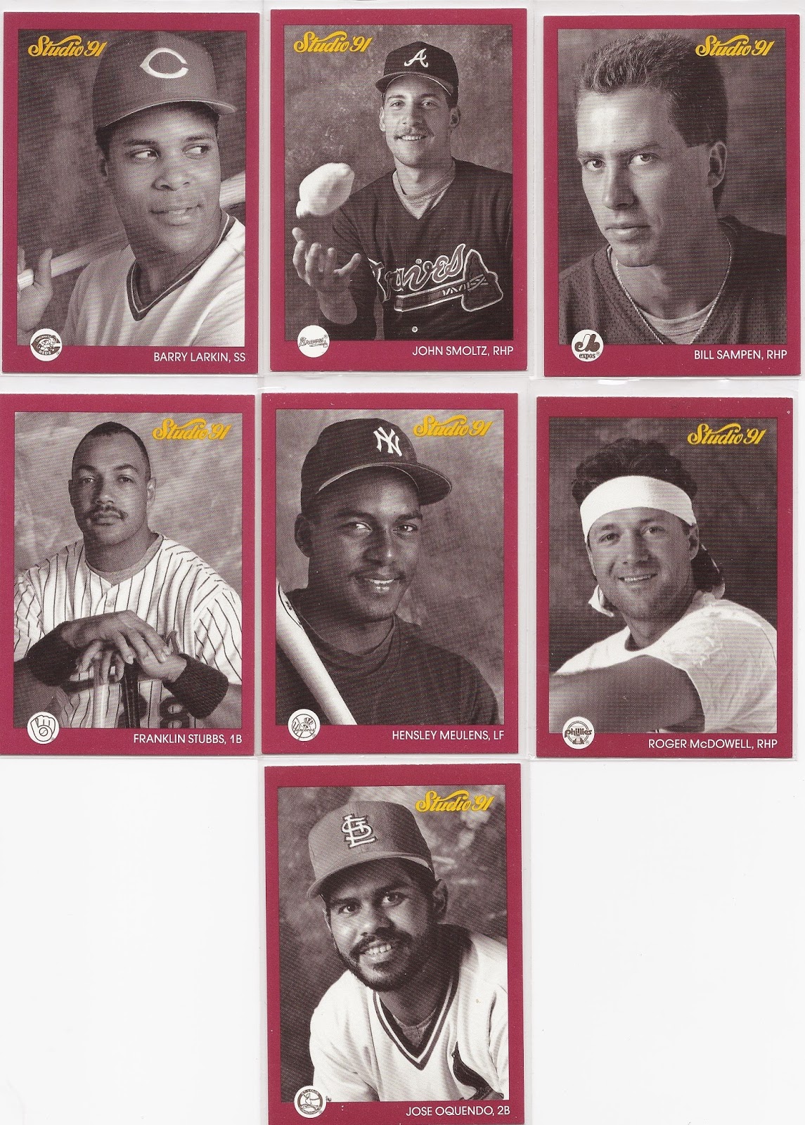
The more Griffeys I amass, the higher the cost of the ones I need; and I've been really embracing the set collector in me as the average cost of new Griffeys has been slowly climbing.  I've even gone ahead and added a whole page of set needs as you can see above (shameless plug), and it has not gone unnoticed.  Repack-master Doug of the always excellent Sportscards from the Dollar Store sent me the last seven cards I needed to complete my master set of 1991 Studio:


When I say "master set," I think I mean every single gettable card of any type for this set.  That's what I always kind of assumed that meant.  There are no more base cards nor promos that aren't represented in the binder - they're all there!  It's my first and possibly my last "master set."


Doug also acknowledged a few of my lesser-known wants such as T.J.'s and a Clutterbuck!  I never get these!


Not to mention a few from my actual favorite hockey player, T.J. Oshie.  There aren't many New Orleanians who can claim they know a single hockey player name let alone have a favorite, but Mr Oshie's been my guy since I saw him in a game against the Blue Jackets a few years back (before the Olympics that helped make him more famous).  I'm still on the hunt for a jersey....


Doug also included a pair of New Orleans players, the first being Mr. Colston here...


...and the second being this lovely Pistol Pete parallel #/60!  Pete remains the PC that is least acknowledged by other bloggers.  I suppose he just doesn't have that many cards, and not many baseball guys collect basketball.  So when one of these comes in the mail I get all fuzzy.

Thanks for the amazing trade package, Doug!  I've got some Delgado and Mookie love coming your way soon enough!

Voulez-Vous Echangez Avec Moi Ce Soir?

$
0
0

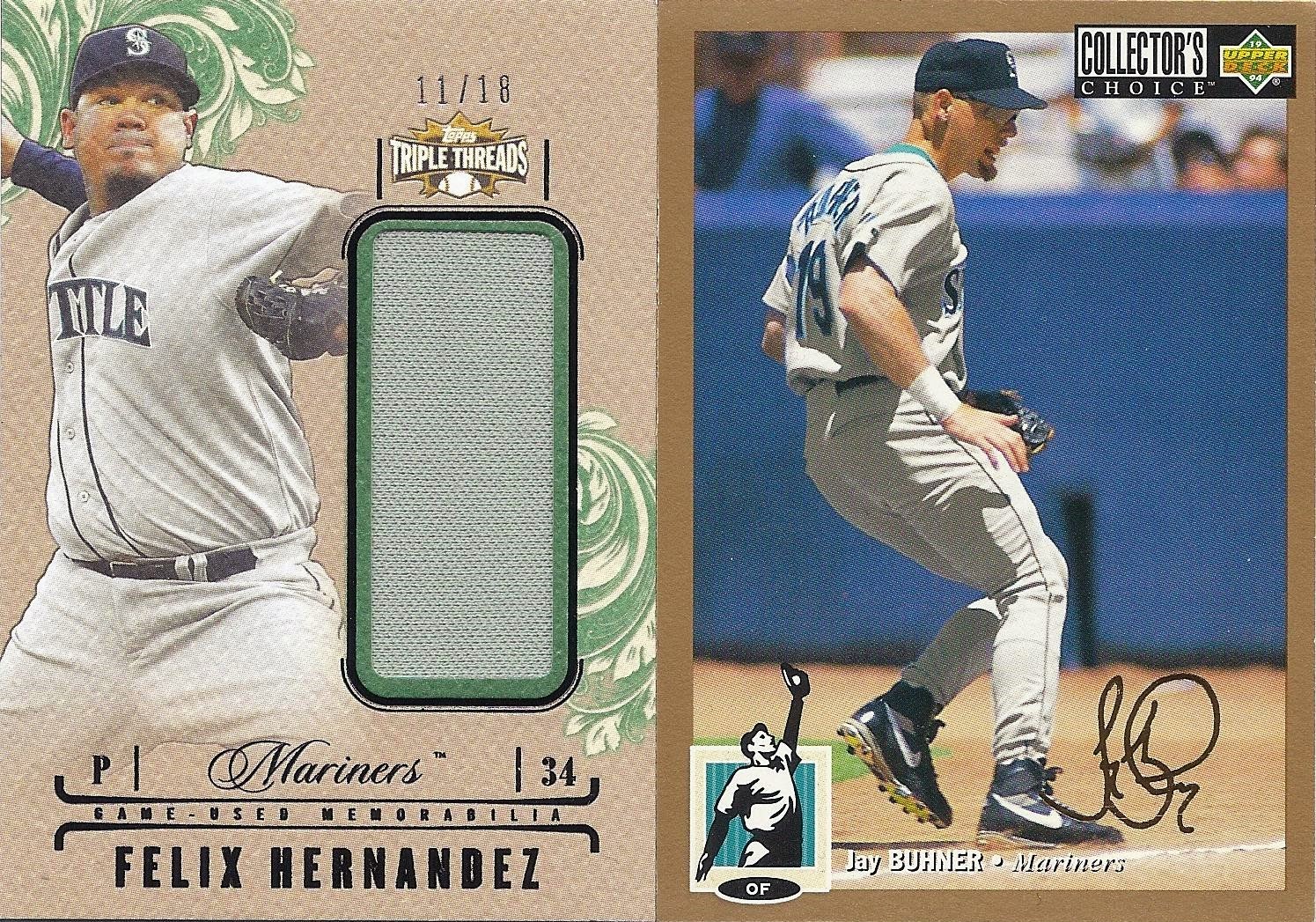
Kevin, mon frere d'une autre mere, has exploded onto the blog scene lately with his numerous 90's box breaks and silly post titles.  He's also making overseas trade look easy.  I got a little box of butterscotch Jello (literally) from him full of cardboard, and it's all quality over quantity.

First and foremost, the above two cards are both rare and stunning additions to my Buhner PC and my King Felix hit collection.  The Felix is #/18 and has a massive relic on it.  And we all know how tough gold signatures are to come across.  Wowwee.


Kevin threw in a couple of Juniors, too, which is hella-generous considering Kevin is also a Griffey man.  I can't get enough of that weird folding Collector's Choice insert on the right (that's the back).  I might actually unfold this one even though it seems wrong to break the seal.


To top it all off, Kev included a pair of unique action shots from '93 Upper Deck, a set that is renowned for its unique action shots.

Great stuff, Kevin!  I've already been hoarding Blue Jays for you.  I'll shoot 'em off to France as soon as my second mortgage goes through (just kidding, but shipping is expensive, non?).

Three-for-Three PWE: a Night Owl Trade Post

$
0
0
Night Owlkilled it on the PWE front the other day.  Here's the proof:


Greg got a couple of these Puigs from his end of the Nachos Grande 2014 SC group break (he got lots of pairs of things, for that matter), and he was nice enough to set one aside for yours truly.  Cool shot of the Puigster being the Puigster, and a step closer to me completing the base set.


Greg is also a major contributor to my PC's of older guys due to his access to vintage.  This Vida Blue Kellogg's 3-D is absolutely gorgeous.  You should see the back.  Wait, why didn't I scan the back?  Anyway, the backs are really cool.


Finally we have a mini from last year's A&G set.  It also happens to be the A&G-back version which makes it an all-new addition to the Griffey collection.

So, yeah.  That PWE went three-for-three.  All new to me, all needed for the three different kinds of collections I chase the most: the occasional set, a handful of PC's, and all the Griffeys.  Great envelope, Greg!  Thanks again!

Nerd Week Day 1: Mystery Science Theater 3000 Superfan

$
0
0
Not every post can be a Fonzie. Sometimes there must be a Ron Howard post, that being a post that is just a little (lot) bit nerdy. I happen to have a few such posts waiting in the wings, so I figure why not shoot them all over the Internet in a single week of unforgiveable nerdiness I am lazily referring to as “Nerd Week.” Enjoy!


I am a massive MST3K fan. I was a huge tape circulator back in the day (I still have hundreds of source tapes I would dub episodes off of), and I have a few items in my collection that kind of put me over the top as a hopeless Mstie.  In fact, this post is by request.  Movie sign...


As for episodes of the show, there are ten seasons plus the original TV broadcasts from KTMA in Minnesota. The first three episodes, KTMA01-03, do not exist in any format, allegedly. Every other episode was recorded and passed along from Mstie to Mstie over the years. I have them all in digital format that I keep in a single, massive file on an external hard drive. In addition to every single gettable episode, I also have a large number of episodes in wonderful SP mode (better quality than EP, LP, or SLP – real Msties know what all those mean) still on VHS with personalized labels. I also have several VCR’s that still work which I keep in storage for if I ever need to dub again.

I’ve done a lot of dubbing in my time.


There are also a number of super-rare, fan-club-only releases of which I have the original VHS’s. These include The Last Dance RAW, The MST Scrapbook, Tom Servo’s Favorite Host Segments, and even some fan footage from one of the few Expo-Fest-Convention-Con-o-Ramas. That’s only a few of them. These are irreplaceable except on eBay and for probably way too much money.  That Rhino copy of The Amazing Colossal Man used to be the "forbidden episode" and go for a fortune ($60 +) on early eBay.  I found mine at Hollywood Video for $9.99.


This is the first release of the DVD.  It was discontinued for years before being re-released a few years ago, but in that in-between time it went on the 'Bay for over $100.  It was crazy, and lucky for me I found it used for incredibly cheap.  Looking back perhaps I should have sold it when it was going for a lot.

Nah.


These I doubt I'll ever sell.  They are original silver-bottomed discs you could only get through the MST3K Info Club.  They are hilarious listens to this very day.  Check out the backs:


How perfect is that?


Here is the original theatrical double-sided marquee poster.  It's massive at 41" x 28", and I have two of them.  The one in worse condition hangs proudly here in my home office.  The good condition one is stored archivally and flat.  You should see that box.  My wife hates it.


This is a limited-edition lithograph sold through Wizard magazine (remember that?!).  It's unframed right now, but the quality is excellent.  I used to have two, but Lord knows what happened to the second one.  Someday when I have more walls...


Here's an 8 x 10 of the original cast with fake autographs.  I bought it already matted and framed for ten bucks at a garage sale.  A local neighborhood garage sale with this.  What are the odds?


And, of course, the obligatory Amazing Colossal Episode Guide.  I laugh hard just reading descriptions of the host segments in this book.  It is a gem and sits on my evacuation shelf with all my photos.

That stuff is fun, but the best evidence of my MST3K nerddom is in my prop collection:


In 1999 when Best Brains, Inc., the company that made the show, went out of business they started taking things from the set and selling them on eBay with signed certificates of authenticity from the prop diva, Bezz McKeever. You remember her from the credits, right?

I won three of the auctions and ended up with Pearl Forrester’s glasses, a baby monitor used as a bomb detonator, and a real, genuine, authentic, honest-to-goodness, camera-used Tom Servo head.


That Servo head is one of my prized possessions. I bought a special case for it and everything. It has come with me on every hurricane evacuation I’ve ever been on. That’s thousands of miles and many days’ worth of hours in the car.

I won’t say what I spent on the three props I bought, but I will say it was a lot of money to me back then. If those auctions happened today I would happily spend triple what I did. There was also one prop I missed out on by just a few dollars due to a computer error. It was a basketball covered in spray paint used as a planet during the opening sequence. There’s not a lot I regret in my life, but man. I really wanted that basketball…

I still occasionally do a search for "MST3Kprop."

I also have several t-shirts, a fan club pack with membership card, a few actual signed photos as opposed to the fake-autographed one above, all the bumper stickers and magnets from the info club, and tons more random stuff.  I also printed out hard copies of the Sci-fi part of the series which is not covered in the Episode Guide (which only goes to Season 7, I think).  Someone actually wrote the rest of the book and it never got published, but you could read it online for free.  I wonder if it's still there...

MST3K taught us a lot of lessons about life:  Make the best of a bad situation.  Don't take everything so seriously.  Stick with your pals to get you through a rough situation with a smile.  When your friends are not around, just build robot friends.  When life gives you lemons, make fun of those lemons.  And finally, it doesn't take a big budget and fancy special effects to produce quality results.

In closing, here's a quick story:  I put a "Movie Sign!" bumper sticker on my first car.  Once I came out of the Post Office to find a girl leaving a note on my windshield that read, and I quote, "Your MST3K bumper sticker rules! Keep circulating the tapes..." I should have proposed on the spot.  I wonder what she's doing now. Probly bein' awesome somewhere.  I still have that note.

If you’re feeling saucy and want to check out a great episode of this show, allow me to recommend Space Mutiny. 


There it is, free, right now.  Do it.  Nerd with me!

See you tomorrow, fellow nerd!

Nerd Week Day 2: a Box of Star Trek TNG Season 3

$
0
0
Not every post can be a Fresh Prince. Sometimes there must be an Urkel post, that being a post that is just a little (lot) bit nerdy. I happen to have a few such posts waiting in the wings, so I figure why not shoot them all over the Internet in a single week of unforgiveable nerdiness I am lazily referring to as “Nerd Week.” Enjoy!


I bought this box a few months ago in a Dave & Adam’s binge. It was only six bucks, and my curiosity got the best of me. Plus Season Three was so good – new uniforms, the return of Beverly, everybody starts having (or building) offspring, the seeds of numerous continuing storylines, and an absolute explosion in general character development.

Let’s look at the inserts first:


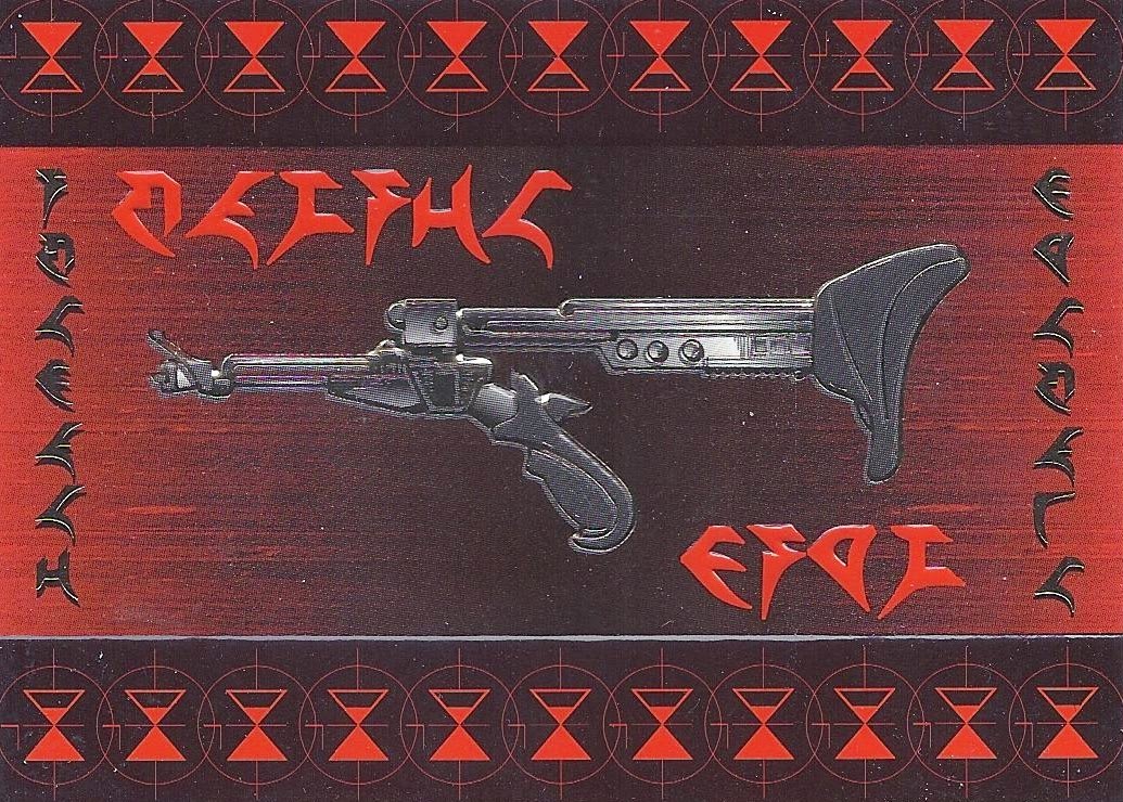
The big pulls from this set seem to be foil weapon art cards and embossed character cards. I pulled a Klingon disruptor as my weapon art card, a reasonably cool-looking card with a fun Klingon aesthetic. The one Klingon aesthetic there ever was and ever will be is a lot of pointy things in red and black. Sometimes brown, too.


The character cards include a pair of the cutest ladies ever to grace a deck of the Enterprise D, Data’s daughter Lal and Worf’s special lady, K'ehleyr. Both characters are super adorbs and possess high butt-touchability. While K'ehleyr has that tall, athletic, lobster-headed she-beast thing going for her, I’m more of a fan of android-next-door Lal’s sporty bangs and ability to use contractions.


There were also a few cards in every pack that featured little foil Federation logos. With no research at all I gleaned that each season’s set of cards concentrated on two regular cast members, giving each their own small subset. Season three included Mr. Worf whose Alexander and Dad-being-a-traitor-to-the-Empire-at-the-Battle-of-Khitomer storylines began this season. The other is Beverly who had just come back to the show after being replaced by Dr. Pulaski in Season Two. Good to have her back, too. Nothing against Pulaski, but Beverly fills out a jumpsuit like no other ginger MILF I’ve ever seen.

Here's the base set:

Star Trek Season Three Title Card
Checklist

For the purposes of the set, the Season is divided up into three-card runs, one run per episode from that season.  The checklist design is reminiscent of the computer interfaces from the show.  Pretty cool.


The base cards are exactly what you would expect: screen shots taken from episodes back before high-def was a thing. They’re grainy and of questionable quality, and they make the show appear dorkier than I remember it ever being.  The superimposition against a spacy background also comes across a little campy (like the show itself), so I absolutely love it.


The space shots featuring ships look a lot better than the character cards. The same was true in the show as well. You have to admit that for its time, the special effects of Next Gen were pretty outstanding.


Did Geordi get some?  Yeah, I like to think he did.


Did Picard hook up with Vash?  Yeah, pretty certain about that one.


That Menage-a-Troi card is amazing on so many levels.  Great scene.  There's Lal again, looking cute as can be.  She ended up playing Lizzie McGuire's mom.  I didn't already know that - IMDB told me when I checked to make sure she wasn't underage so I could be legally attracted to her.  She was 28.  Phew.

Anyhoo, I was able to pull two complete sets out of that box.  How often does that happen with baseball boxes?  I also got a stack of dupes.  They're yours for the claiming, gentle reader.

Am I going to collect the other Seasons?  Not actively.  I guess I wouldn't turn them down if I happened upon them at some point.  Perhaps I'll find a super cheap box at a show or something.  Can't count that out.  But no, I'm not in active pursuit of them.  That's like a whole other level.

See you tomorrow, fellow nerds!

Nerd Week Day 3: Legos!

$
0
0
Not every post can be an Alpha Beta. Sometimes there must be a Lambda Lamda Lambda post, that being a post that is just a little (lot) bit nerdy. I happen to have a few such posts waiting in the wings, so I figure why not shoot them all over the Internet in a single week of unforgiveable nerdiness I am lazily referring to as “Nerd Week.” Enjoy!

I’ve always been a Lego nut, and as I’ve gotten older they have only gotten cooler. Nowadays we get sets that pay homage to pop culture, TV shows, and movies, the most prolific of which has been the brand’s extensive line of Star Wars vehicles and figures.


The crown jewel of my Lego nerddom is definitely this behemoth Super Star Destroyer. It took roughly 11 hours to assemble.  Please forgive the asses in the top left corner - that's a giant Pink Floyd poster in the back room of my man cave where the Lego shelves live.


At 50 inches, the Super Star Destroyer is so big I can't really even photograph it properly.  The coolest part is this little regular-sized star destroyer shown for scale.


As you can see I have a fun mix of other Star Wars models and figures, too. I’m a big fan of the TIE fighter there on the left.


Below that on my man cave shelves are a few other fun items including the Ghostbusters ECTO-1, the Back to the Future Delorean, and the Simpsons house.

When Lego came out with the Simpsons Minifigures, my buddy Craig and I canvassed the town looking for them. It took several trips to different stores, but we eventually found a full end cap display at Target and bought the entire thing so we could bring them home and take our time feeling through the little packages until we had two of every figure. We returned the rest and called it a day. I’m happy to report that each of us now has the full first series, and we plan on doing the same thing again for the second. We are Simpsons completionists, and the Simpsons-Lego crossover cannot be resisted.


The recent line of Lego Architecture has been a blast to collect as well. Here are the White House, the Space Needle, the Eiffel Tower, and the Empire State Building in all their tiny little meticulously-detailed glory. These sets are kind of pricey, but a fun excuse to play Legos as an adult.  I only have some of the cheaper ones here, but Fallingwater and the Farnsworth House will be mine someday...

In addition to all this stuff, I have two massive bins full to the top with every Lego I’ve ever owned in my whole life. Whenever I come across a loose brick floating around in the world without a home, I rescue it. After Katrina I cleaned and disinfected thousands of my friends’ Legos rather than let them end up in the dump. I am positively anal about those expensive little bits of plastic.

See you tomorrow, fellow nerd!

Nerd Week Day 4: Star Trek Master Series

$
0
0
Not every post can be a Bart. Sometimes there must be a Milhouse post, that being a post that is just a little (lot) bit nerdy. I happen to have a few such posts waiting in the wings, so I figure why not shoot them all over the Internet in a single week of unforgiveable nerdiness I am lazily referring to as “Nerd Week.” Enjoy!


Today’s nerdy post is all about Star Trek, specifically a single set of cards I got from The Prowling Cat when he was cleaning out his closet all Eminem-style.  The set is called the Star Trek Master Series, and it was printed by SkyBox in 1993.  They are 90 really beautiful, finely-crafted cards that span the Star Trek Universe from the original series through Next Generation and ending just before the beginning Deep Space Nine. Personally I was most enamored with TNG, so these are right in my fandom wheelhouse.


The art is extremely solid, just stylized enough to not be considered one of those hyper-realistic paintings of a photograph which, while super neat, are kind of an artistic cop-out. The subjects are the principal characters, ships, races, aliens, and moments from the two series condensed nicely into a fan-friendly 90 cards. I mean “fan-friendly” in that the set is easy for fans of the shows to love. I’m sure there are a lot of fans who can spot glaring omissions from both series in the set. Those fans need to relax. These cards are excellent.


Okay, some of them are kind of silly, actually, but that's part of the charm.  And that Orion Slave Girl belongs in Maxim, or possibly my trunk.  Yowza.


I've picked out a bunch of my favorites from the set to show you.  For example, that card of Reg after he took over the Enterprise from the Holodeck.  And they discover that race of beings who are essentially floating old man heads who are like, "Oh, bipedal motion!  Electrochemical nerve induction!" because they are super observant and stuff.  Great episode.  Also, Q's hat.


I should go ahead and mention I'll be showing a LOT of the TNG cards because they are my homies and because the set is very TNG-centric in general, probably because of its 1993-ness.


Check out the disproportionately massive bat'leth (spelling?) and the goofy depiction of the Traveller who is Wesley's magical best friend (seriously).  These cards a little silly, but the episodes they depict are damn good.  And I like The Traveller, no matter how much I poke fun.  He's in one of my favorite episodes, "Remember Me," which is a fun but disturbing mind-f***.


The Borg are referenced a lot because everybody just loves them.  They're kind of the perfect enemy, and their assimilation modifications gave us an excellent look at Picard's nipples.


Shameless plug for the newest series, anyone?  I'll take it, but I never got as hard into that series as I was with TNG.  This card would be a whole lot neater if they got the proportions and angle of view right.


Finally, here are all the "Theatrical" cards.  The set must have come out just before the TNG movies started coming out, the first of which was Generations.  If you haven't seen the original Star Trek movies, go ahead and give 'em a try, but skip the first one.  If you get really into them, go back and watch.  The story is pretty cool, but it's a terrible first outing,

According to the checklist there are five "Spectra" cards to be had as well as some artist-signed editions of a dozen or so cards from the set.  Do I want all those?  I mean, yeah.  I guess I do.  This is nerd week.  I can admit to that.

If you're a Trek fan, you should probably watch this:


Thanks again for the cards, TPC, and see you tomorrow, fellow nerds!

Nerd Week Day 5 Finale: Nerdstuff and a Very Nerdy Giveaway

$
0
0
So my wife says to me the other day, “You’ve turned me into a nerd!” I was taken aback to say the least, but once she elaborated a little I realized just how true this was. When we met in college my wife was coming from being a popular “jock” of sorts in high school. She ate at Chili’s, drank light beer, and listened to whatever awful nonsense was on the radio at the time.

Now she sips pho and eats salmon sashimi like a champ. She’s seen every episode of Star Trek:TNG and read the entire Ender’s Game series, including the Bean subseries. And she’s seen Neutral Milk Hotel in concert. It’s true – I turned my wife into a nerd, and she loves it.

That conversation was the real catalyst for this series of posts. It made me realize just how much of a nerd I had become, and just how awesome that was. It’s not like I even try and hide it, really. A quick walk around my house will reveal just how big a nerd you are dealing with:


For example, I have an autograph collection, and the majority of the music-related ones end up on this wall. There’s plenty of not-nerdy items here in addition to a healthy mix from across the nerd spectrum:

Not all that nerdy: Brian Wilson, Dr. John, Herbie Hancock, Galactic, Fishbone
Pretty nerdy: Yo La Tengo, Grandaddy, The Refreshments, The Rentals
Indisputably nerdy: MC Chris, They Might Be Giants

There’s also a framed photo from when I got to interview Flansburgh, the bespectacled John of They Might Be Giants. Digital photography either didn’t exist back then or it was very expensive, so the photo is super grainy and my eyes are closed. :-(

My autographs get a lot nerdier as you leave the music realm and enter the Comic Con realm:


My wife got me the Star Trek:TNG VIP experience at Comic Con last year. I met everybody except for Patrick Stewart who was in Canada narrating a documentary. He was nice enough to sign everybody’s poster, but he didn’t make the group photo my wife and I got to take with the entire cast. I will not be showing that photo here because it would melt your screen. Here’s a funny tidbit from the signings:


Crusher’s hand is in Picard’s pocket in the poster photo, and she apparently did not remember that until seeing the poster so she wrote this fun little remark. Super nice lady, too. All of them were really cool. I especially enjoyed talking to John Delancey who played Q (you can see his sig in gold on the bottom) as well as Marina Sirtis and Levar Burton.


Grabbed one of these, too. Levar was a smiley delight, but try fitting that signature on a 2x3 card.  Or a sticker for that matter.  Can you imagine?


In case you’re not sick of Star Trek yet, the folks who ran the Con sent out an e-mail about the VIP package stating that it included a signed 8x10 of Patrick Stewart. I printed that baby out, and when I got to the Con the people in charge insisted that it was an error but let me pick one out, anyway. So, here’s Picard in his dress whites. Can you feel the nerd tonight?


I also met Kevin Eastman who was the friendliest, most accommodating person at the con. He even did some doodles for people if they were willing to wait in the crazy-long doodle line. I had nerdier places to be, so I got the fast-track “To T.J.”


One more Comic Con item: a scale model of the Arrakis Crysknife made from the tooth of the mighty worm. Spolier alert: the worm is the spice. Nerdgasm.

That’s it for the Comic Con stuff. Lucky for you (or possibly unlucky) I took a few minutes walking around my house looking for more things that are nerdy. I took a picture of the nerd-things as I found them. Here are a few of those pictures:


This is a Sailor Moon lunchbox. That’s pretty damn nerdy. What’s inside?


Yeesh: Star Wars and Trek Micro Machines. My God - it’s full of nerd (bonus nerd quote).


Okay, these were all gifts. Friends and family all know I’m a “collector of collections," but I’ve never been a big Pez dispenser guy even though I love the candy. Yet, here they are, mass-produced to the point of being worthless as a collectable. Still, I kinda like them as a big, sealed set, being a nerd and all.


I still have every Mad Magazine my Mom ever bought me at the supermarket. This one I bought long after I stopped reading the magazine just for the cover. Was Mad nerdy or cool? I can’t remember…


This poster is several levels of nerdy, but if you’re a nerd it’s several levels of awesome. My only gripe is that it shows a 20-sided die while the song references a 12-sided one. Other than that, it’s pretty amazing.  And yet...


...this puppy takes the prize as my nerdiest poster not signed by the cast of Star Trek.  It hangs in my office as opposed to somewhere my wife could see it.  It's just too damn nerdy for that girl.


This lives in the man cave with four controllers, always ready for battle. This cartridge along with my Portal 2 disc are in a tie for second place as my most-played video games (Civilization takes that prize #nerdbasedstrategy).


I pity the fool who don’t celebrate his own nerdiness with a blog post!


This is nerdy even for me, but don’t deny it: you want one.


I’m not sure if this is nerdy or just insane. Leaning towards insane. Like, certifiable. But if you ever get the chance to read what this book is made up of, its inherent nerdiness will reveal itself.  (Note: I've tried it.  Doesn't work.)


This is my media wall which resides in our spare bedroom. It used to be two walls and take up a LOT more space. I was strongly encouraged by my betrothed to downsize this collection, so what you’re looking at is about 20% of my former VHS collection, 40% of my CD’s, and about half of my DVD’s. While most of that stuff went to Goodwill, I still have all the DVD’s in bins at a friend’s house. A respectable media collection is one of the hallmarks of a nerdy collector.


Here’s a closer look at the DVD’s in case you feel like judging my taste. Frankly the DVD selection is one of my favorite things to look at when I go to parties at other peoples’ houses. It’s amazing the things you’ll discover, particularly that a lot of people like bad movies.


This is the They Might Be Giants portion of the CD collection. They do not have the most CD's of any band on those shelves (I have more of both Radiohead and the Beach Boys); but they do have the most discs represented of any nerdy band I love, so I thought they’d be appropriate for this post. I also have similar stacks for Yo La Tengo, The Magnetic Fields, and Grandaddy. Nerdy music rules.


Finally: I am the author of a baseball card blog. This is arguably my nerdiest attribute (right up there with that Sailor Moon lunchbox), but it’s also ridiculously fun. It’s tied to sports which is like the least nerdy thing there is, but it’s also tied to statistics which is widely regarded as – you guessed it – pretty nerdy, y’all. The result is an interesting mix of nerds, jocks, and everyone in between chasing the same cards, and some of them bothering to pen a word or two about them. That’s where I (and some of you) come in. Card bloggers are very much a form of nerd, and yet they’re some of the coolest people I know.

Nerd Epilogue and Giveaway

Now, this and previous posts could be construed as gloating. “Hey, look at my stuff! You jelly?” But keep in mind that I never would have shown people this stuff ten years ago, and fifteen years ago I would have buried my head in the sand if I knew a girl might see what I collect (girls were scary).

And yet there’s a certain amount of comfort in one’s identity and confidence of character that comes along with growing up. I guess that’s what these posts are really about. I’ve always considered myself a reasonably cool dude who happens to like nerdy things, but to heck with that. I’m clearly a nerd. In fact I’m damn proud to be a nerd, and you should be, too.

Kids seem a little more tolerant of nerds these days than when I was in school, and why shouldn’t they be? Nerds have higher average incomes, tend to be well-educated and well-spoken, can hold informed conversations, know how to do stuff (besides fix your computer), respect the warning of “spoiler alert” better than anyone, and most importantly they have the best taste in music, film, art, food, and t-shirts. Plus nerd girls are so much cuter than your run-of-the-mill sorority chicks it’s not even funny.

And they all watch Adventure Time

So in honor of nerds everywhere, I’m having a giveaway. I want to see the nerdiest thing you have. One item only, please. It can be an object, a tattoo, a book, a poster, a signed photo, a vinyl record, a report card, a ridiculous Lego creation, a fluffy cat sweater – whatever. A thing that announces to the world, “I am a nerd, world, and you can suck it.”

Here is the prize:


A sealed blu-ray of the final installment of the Family Guy Star Wars homages. I will also throw in other nerdy things and some baseball cards if that’s your thing (which it probably is if you found your way here, ya big nerd).

You can either make your own blog post about your nerd thing and link to it in the comments below, or you can e-mail me a photo at thejuniorjunkie at gmail dot com. Either is fine. If you include multiple images in either method, I will accept the first image by default unless another is indicated as your entry. No shyness. I will be showing some of them in a future post.

So let your freak flag fly, blogosphere. Keep calm, and nerd on.


Back to Baseball: A Dozen New Griffeys and a Sort

$
0
0
After taking a week off to talk about nerdy things, it's time to get back to the roots of this blog: Griffey cards!  I did a sort tonight, but not before scanning some of the cooler additions to the collection.


I can't believe I didn't already have this one, but it's true.  There are two versions of this pre-rookie, and this is the rarer one.  I have three of the other one which shows Griffey posing in a white Jersey.


This is one of those Skybox Molten Metal cards with the hilariously bad hip-hop blurb on the back. It's a parallel, too, made entirely of steel.


I have very few Topps HD inserts, so here is a fun die-cut one.


This is one of the great die-cut inserts of the 90's.  It's striking and ahead of its time, for sure, and it's probably the most expensive of the cards I'm showing tonight.


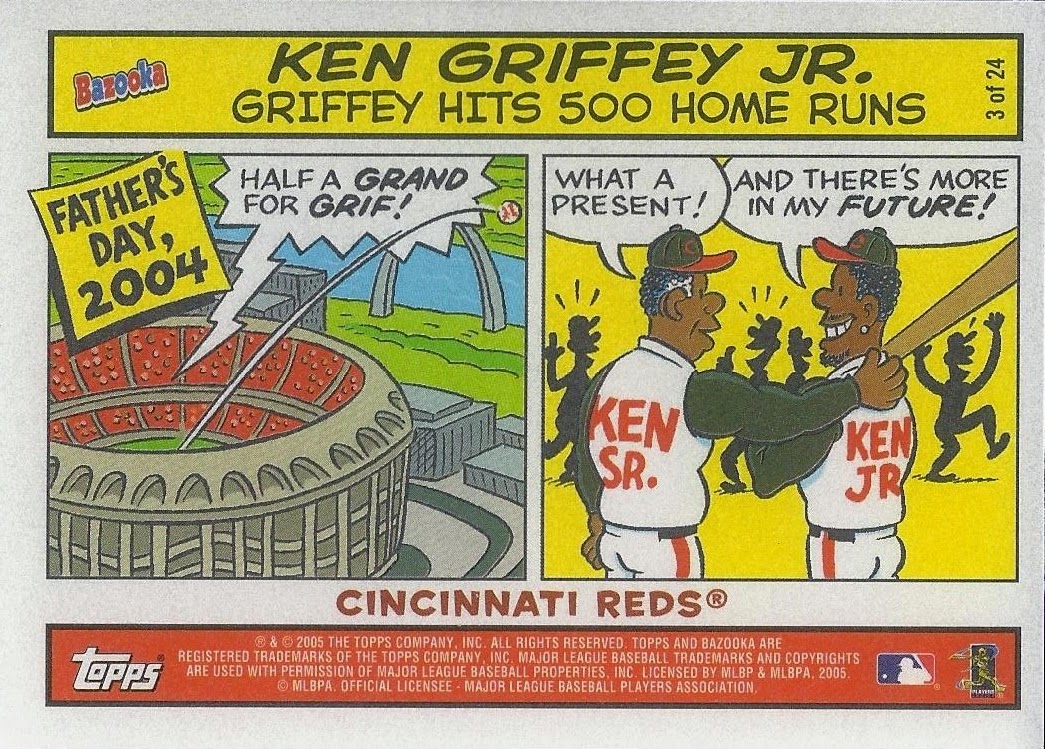
I love comic cards, cards with both Junior and Senior, and cards celebrating Griffey's 500th home run.  This card is the center of that Venn diagram of collectability.


A new base card, this one from 2014 Triple Threads.  This card is way too thick for the binder.


I only just learned about these expansion stamped '93 Topps cards.  Here is the Marlins stamped version.  I have yet to acquire the Rockies version and, of course, all the All-Star cards, too.  This will probably end up being a pretty long-term project as many of them are a bit overpriced.  You hear me, sellers?  You want too much for your cardboard.


Just a really neat insert from near the end of the Donruss timeline.  It's numbered out of 250, but I landed it for a song thanks to COMC Black Friday.


I've been chasing this thing for a while now.  Everybody thinks their 90's inserts are still worth a fortune, so I had to wait out the sellers until one of them came to his senses.


One of the most notorious inserts of the 90's ever, and I finally landed one.  Took me a while for the same reason as the Grasskickers card above.


These '95 Donruss Showdown cards are numbered out of 10,000.  I busted numerous packs of this back in the day and landed a couple of them, but none were this amazing Griffey/Maddux combo.  I really love this card.


I purposefully did not edit this scan all the way because I want you to see the massive shadow cast by this immensely thick 2014 Panini Immaculate Collection base card.  It casts darkness in a way comparable to the monolith that cast a shadow on a moon of Jupiter to open a portal to another dimension.  It's certainly thickest card I own that doesn't contain a relic/manupatch/tiny little trophy.  The thing is downright absurd.  I'm currently using it to stabilize a rocky table.  A big one.

The sort was a success with a final count of 81 total Griffeys added, 58 of which were entirely new to the collection.  That's a duplicate ratio of 1.397.  This brings the collection slash line to 6832/3569/1.914.  That's a drop in the dupe ratio of .009 with less than a hundred cards added.  Not bad...

Okay, so we're going back to baseball cards this week, but there's still time to submit your nerdiest thing for the Nerd Giveaway.  I've had some great entries so far, so make it super nerdy!

Way Too Many Words About 1996 Pinnacle

$
0
0

I’ve always been a fan of Pinnacle (yes, even the uglified ’97 set) right up until they disappeared from the market. I ended up buying a lot of packs of the ’96 product (probably because it was one of the only brands carried by my local pharmacy) and was never disappointed by the cool inserts and parallels. Even the photography in the set was solid enough. Unfortunately I seem to be one of the only folks who feels that way. This is a set with a lot of positive attributes that is generally spurned by the collecting crowd.

Horizontal and vertical versions

The cards in the ’96 set are thicker than your average base card but highly susceptible to damage due to the relative softness of the paper stock and gold foil along the bottom edge. Slipping one into a penny sleeve without softening a corner feels like performing surgery. This is less true of the parallels which are somehow a little hardier against damage.

This set was swimming with Piazza's.

Despite the fragility of the cards, the quality of the full-bleed photo printing in this set is excellent. Nearly every card is bright and exciting. I’m also a fan of the foil texturing in the nameplate with the little player silhouette and foil effects. Despite all this, I must admit that the design as a whole is not all that appealing. I blame the awkward triangular nameplate and mind-bogglingly plain black font, both characteristics that would stick around for the ’97 design for some reason.

But what this set lacks in base design pizzazz it more than makes up for with some really great inserts, my favorite of which doesn’t even have a Griffey in it.


The Christie Brinkley Collection is among the most interesting inserts of the 90's. The whole thing is comprised of the biggest stars from the Braves and the Indians in fun, goofy, and heartfelt poses. You’ve got pictures with kids, autographs shots, gum bubbles, golf clubs, fun with equipment, and even Carlos Baerga’s nipple (which I don't have yet). What more could a kid ask for?


That sounded like a jab, but this is a really great set of cards. I’ve even started building the set, something I never do for inserts. I like it that much. The lack of a Griffey is its only problem.

Let’s take a moment to talk about Starburst, Artist’s Proof, and the mysterious Foil parallel. Starburst is unique in that it is a cross-series insert with all the attributes of a parallel. Artist’s Proof is the parallel of the Starburst insert indicated by the words “Artist’s Proof” stamped right into the Dufex. The Starburst checklist is 200 cards, 100 from each series, presumably only stars and a few of their subset cards. Griffey has seven cards in the regular base set, four of which were given the Starburst and AP treatment.

Regular vs. Starburst Artist's Proof

Foil is a parallel that was only found for Series 2 and seemingly only for a handful of cards. This is confusing to many collectors because every card in 1996 Pinnacle has foil on it. Take a look on eBay – plenty of sellers include the words “gold foil,” and some even use the word “version”in reference to the regular base card. Those sellers are either deceptive or misinformed. The real foil cards of ’96 Pinnacle are obvious: shiny foil permeates every square inch of the card including the photo. It’s that dark, papery foil that doesn’t scan well.

Regular vs. Foil

I suspect they came with factory sets or something like that, but to be honest their origin is a mystery even to me. Perhaps someone could enlighten us in the comments…?

Here are the Griffeys:

1996 Pinnacle #122

Here is one of my favorite Griffey base cards of the 90’s – a studio-taken hero shot. All he needs is a cape and the guy is ready to fight crime and bring peace and security to the people of Seattle. I don’t even mind the blue drop cloth as a backdrop like it’s elementary school picture day. It works.

The photo on the back is a great fielding shot of the Kid, or is it? Is that white speck on the right the ball? Pretty sure it is. Junior’s glove is closed, so he either just made a great leaping wall catch and that white speck is just a white speck (I doubt this), or that’s the ball and someone just hit a double. A Yankee fan must have picked this photo. Still, action packed, right? Can’t deny that. I don’t even mind the truncated stat box to make room for the photo. Overall, a really cool card.

I should mention that I do have one problem with the blurb here. We all know that Griffey homered from both sides of the plate three times in four days (I mean, who doesn’t?); but the writer neglected to mention that during the 1995 season Junior also created the perfect pancake recipe, saved the orphanage from a maniacal real estate investor, gave birth to a litter of fuzzy kittens, delivered the crystal of An’rak to the peaceful inhabitants of the planet Quango, and died saving a gerbil from a house fire only to be resurrected seventeen minutes later in a giant pot of sawmill gravy at a Cracker Barrel in Reno, Nevada. Because you can write whatever you want now regardless of things like accuracy and truth. A monkey in a track suit invented ketchup. There, now that happened.


So yeah, I was unable to find any information that would confirm nor deny whether Junior ever hit a right-handed dinger, but common sense tells me that someone at Pinnacle made a mistake there. Let’s move on lest you stop believing me that this set is actually pretty good.

Here is the Starburst parallel:

1996 Pinnacle Starburst #41

That's unmistakably Pinnacle's proprietary Dufex printing.  The only differences on the back are the Starburst logo and the card numeration which suggests an insert as opposed to a parallel.  While I am cataloging these as the former, they have all the attributes of the latter.

1996 Pinnacle #134 The Naturals

The Naturals has the feel of a subset that’s been around for ages due in part to the great logo, but there’s really not much to it. Okay picture, innocuous blurb, zero stats – this is that same old simple padding of the checklist with superstars that was so rampant in the 90’s. The Starburst version looks pretty cool, though.

1996 Pinnacle Starburst #61 The Naturals

This Dufex pattern is different from the base card with soft waves that emanate from the Naturals logo.  It's different for every type of card.

1996 Pinnacle #195 AL Checklist

You have to give Pinnacle credit – for setlist padding, the checklists are pretty damn awesome. There’s only 61 cards on here, leaving plenty of room for more checklists and, therefore more star cards in the overall checklist. Mix in parallels and that number triples or quadruples, depending on which series you’re looking at (the foil parallel exclusive to Series 2). But I digress. Here’s a nice portrait shot of a very smiley Junior representing the American League half of the checklist.

1996 Pinnacle #255 Hardball Heroes

The first Griffey in Series 2 is yet another subset sporting a unique logo. The design doesn’t stray far from the regular base design, but it does feature some of the baseball stitching reminiscent of the 1995 set. The subset as a whole isn’t anything special, but the photo here is great. It’s well-framed and prominently features that big MLB Anniversary patch. I can take or leave this as a card, but as a Griffey it is indispensable. I do have questions about the cocktail party going on in the dugout.

Here's the foil:

1996 Pinnacle #255 Hardball Heroes Foil

So dark.  You can barely make out the dugout box social.

1996 Pinnacle #301.8 .300 Series

Here is one subset I can really get behind – all the guys who broke .300. Pretty neat idea. Oh, and the cards are numbered each player’s lifetime average. Fun! Junior’s lifetime average on every other card from 1996 is .302, but Pinnacle decided to get technical with that fourth decimal place. Why? Because Will Clark hit .302, and you can’t have two #302’s (even though there are two #305's in this set. What?).  Hence Griffey is card #301.8 which I believe may be the first baseball card numbered with a decimal.

The card itself has a great horizontal design with the player average bold against a prominent field of gold foil. There hangs the team logo which radiates fun foil effects similar to the kind in the angular nameplate of the base cards. In the photo Junior hustles in from the outfield sporting his fly Oakleys and whistling a jaunty tune (the jauntiness is assumed – he’s a Mariner, after all). The whistling aspect is fun and unique as is the wide-angle ballpark refection in his sunglasses. The stat-a-riffic blurb and superimposed, cucumber-cool baserunning shot round out an attractive card back. 1996 Pinnacle #301.8 is a big hit with me and among my favorite Griffey subset cards of the 90’s.

1996 Pinnacle #301.8 .300 Series Foil

This one actually looks pretty good in foil.

1996 Pinnacle Starburst #185 Artist Proof

Here is the Starburst Artist's Proof parallel of that .300 Series card.  The AP text almost ruins the great Dufex swirl, but the solid gold field is downright microscope-worthy.  As usual the back is identical apart from the Starburst logo and numeration which now goes to 200 for series 2.  There is nothing different about the AP's.  Sadly this is my only AP parallel from '96.  They were such difficult pulls back in the day that they still command top dollar.

1996 Pinnacle #394 AL Checklist

Another AL checklist and another smiley portrait of the Kid. Not a bad Griffey card. A little dry, but not bad.

1996 Pinnacle #399 Chase Checklist (w/ Thomas, Ripken, Maddux, Jones, & Piazza)

Okay, what? This thing is bananas. The Kid, the Big Hurt, the Iron Man, Mad Dog, Chipper, and….Mike all on one card? Sure it’s a collage as opposed to a single photo (Select did a fun digital version of this), but it’s kind of awesome in the same way that eating salsa with Doritos is awesome. Yum, but also blech. Too much.

This is the insert checklist which Pinnacle refers to as the “Chase Program Checklist.” Fancy. And it’s really just close-cropped versions of all these guys’ respective base checklists. Hm. I’m so ambivalent about this card I don’t even know what to type. Thank goodness I don’t have the Starburst version as it would probably break my scanner with its heaviness. Let’s move on to the inserts before we hurt ourselves.

The inserts of ’96 Pinnacle are super disco, and by that I mean they are loud and flashy and maybe even a little obnoxious. They’re also pretty damn fun. Take a look:

1996 Pinnacle Power #3

Settle in. We’re gonna talk about this one for a sec.

When I first saw one of these inserts I was 15 - I pulled the Mike Piazza out of a pack and just beheld the crap out of it for minutes on end. I touched and rubbed and felt that thing up like it was taking me to the prom.

To this day it’s one of the most interesting cards texturally that I’ve ever seen. I know that giant ridged holofoil home plate leaps out at you like a cheetah on fire, but it’s not the wildest design feature here – it’s that matte black background. It makes everything that isn’t it explode off the card, into your retinas, and out the back of your skull like a SCUD missile made of gold foil and rainbows.

Take each element on its own: matte black background, soft to the touch and actively annihilating light in any form like a cardboard black hole. The player silhouette, embossed and glossy, lively against the still black. The home plate, ridged like an atomic Ruffle and gleaming from ROY to BIV and everywhere in-between (G). The gold foil, raised in perfect rounded arcs in the text and along the bottom edge of the home plate to give dimension to the great, spectral beast. This is basically an 8.75 square-inch theme park of textures and light effects. If you don’t like it, you probably also don’t like candy or America.

A blind person could spend ten seconds with this card and think, “Damn, that’s pretty baddass.”

I really only have two problems with this card: first, it is extremely tacky. Yeah, I get that. Then again, it’s a baseball card – it can be wild and fun. This is not a family sedan. Modesty be damned.

My second problem, and this one is far worse, is that it damages easily, and it’s all the fault of that matte black stuff I love so much. Apart from the obvious threat of soft edges and white corners, it could potentially be ruined forever with one swipe of even a mildly greasy finger. So don’t eat French fries before handling this card unless you use protection (penny sleeves at least, please).

That was like a whole post right there, wasn’t it? Sorry – I have strong feelings about 1996 Pinnacle Power.

1996 Pinnacle Team Spirit #2

So, yeah. This is the same basic card as Pinnacle Power without the ridges. So go back and read all that stuff I wrote up there, mentally removing everything about the “home plate” element, and you've pretty much got it.

1996 Pinnacle Slugfest #2

Slugfest is kind of the perfect Pinnacle insert: Dufex, obvy, but also lots of eye-catching color, different photos on the front and back, a solid blurb that is related to the title/theme of the insert, and its own logo. Plus it’s just a little over the top - one might say tastefully tacky. That pretty much sums up the 90’s for me.

Here are the Griffeys I need from '96 Pinnacle:

1996 Pinnacle Starburst #41 Artist’s Proof
1996 Pinnacle Starburst #61 The Naturals Artist's Proof
1996 Pinnacle Starburst #155 Hardball Heroes
1996 Pinnacle Starburst #155 Hardball Heroes Artist’s Proof
1996 Pinnacle Starburst #185 300 Series
1996 Pinnacle All-Star Fan Fest #3
1996 Pinnacle Essence of the Game #7
1996 Pinnacle First Rate #1
1996 Pinnacle Skylines #1
1996 Pinnacle Team Pinnacle #6 (w/ Reggie Sanders)

People don’t seem to appreciate Pinnacle this late in their timeline, but I think this is a solid B set. A little tweaking of the nameplate (shoot, just a cool font) would move it into B+/A- territory for me. Am I being too nice?

I can't even complain all that much about the rampant overuse of the same stable of star players on card after card. Frankly I’m impressed at the shamelessness with which Pinnacle padded their checklist. Seven out of the 400 base cards are Griffeys - that’s 1.75%. It doesn’t sound like much, but it is. Their saving grace to your average collector is that the cards are cool; their saving grace to me is that I like Griffeys. Everyone wins.

2014 Stadium Club: Where Every Card is an SP

$
0
0

Not really, the thing about all the cards being SP’s. There are no SP’s in 2014 Stadium Club, but if I didn’t already know that I would think I had a ton of ‘em. Look at these:


Again, these are not SP’s – none of them. This is like a dream base set, the one we’ve been waiting for. Exciting, intriguing, and just plain different photos of our favorite players from yesterday and today. The different part is especially refreshing as we’ve all seen the same handful of photos reused over and over.

How often do you see a presidential selfie card that isn't an SP?

Before we move on I should mention that I've completed this set by cheating.  I knew pretty early on that I wanted to build the base set, and upon seeing the majority of the Field Access insert I decided to go ahead and build that, too. After breaking two boxes and pulling less than 60% of the base set (and far less of Field Access) between them, I decided to see what the completed base set was going for on eBay which turned out to be around sixty bucks.  Seemed a little steep.

One day someone listed an auction for the complete base set plus the completed Field Access, Future Stars, and Legends Die-Cuts insert sets. The opening bid was fifty bucks, and I went ahead and bid the minimum fully expecting the auction to break $100. Maybe it was the fact that the listing had no pictures or that the wording and punctuation were a little strange, but I won with no competition. A few weeks later they were all in a binder on my shelf. I felt kind of bad for the seller, too, considering how much more he could have made had he carded the sets out.

Complete base set and three complete insert sets


I may go back and sell the Legends and Future Stars sets as they are going for a pretty penny on the ‘bay, and I’d like to recoup some of that fifty bucks. Field Access is staying in the binder with the base set because it’s great.

Now that you know my dirty secret, here are a bunch more base cards.  Note the plethora of horizontal photos, autograph signers, and celebration shots.


Long story short, I have zero complaints about this base set. Well done, Topps. You’ve set the bar really high for next year’s set. Don’t blow it.

Let’s talk about the boxes themselves.


So much Griffey love I can barely stand it. These look like Upper Deck boxes from the late 90’s in the best way possible. The packs themselves look fantastic, too, in deep blue chrome with a stately Stadium Club logo emblazoned across the front in silver and white. They’re downright candy-like.

The boxes I’ve seen priced everywhere between $50.00 and $125.00. I was lucky enough to land two boxes for $55 apiece, but pulled very little of substance apart from a #/50 auto of a rookie I don’t know (lots of rookie auto’s to be had). And the thing about the third pack always holding the auto that Nachos Grande discovered in his group break is dead-on, not that it matters much since you’re not supposed to be able to buy individual packs.

Bring on the Griffeys:

2014 Stadium Club #1

And look who got #1 in the set. There are plenty of pictures of Griffey swinging a bat out there, but this one is as dynamic and explosive as they come. Junior’s face is frozen in a position of deep focus and effort (and probably a fair amount of exhale). Plus who doesn’t love a bendy bat photo?

Generally speaking the design here is perfect for the Stadium Club design timeline. Beautifully-printed, full-bleed photography with a low-profile nameplate that doesn’t interfere with the showcasing of said photography. It’s even accommodating to the parallels (though the spectacularly-cool Matrix parallel is missing - again).

The card back is excellent for having nothing in common with the front – it’s like a whole new card back there, and it’s good. Most noticeable among the Griffey fans should be the trademark backwards cap in portrait. The use of team color is excellent - Seattle blues and greens abound - and I’m all about the great “scoreboard” theme.

Something that I haven’t seen mentioned often is the ball field background which is a Stadium Club staple from way back. Here’s the back of the Griffey card from the inaugural Stadium Club:


See the similarity? A full-bleed green and brown depiction of a ball field, the prevalent aesthetic of both the ’91 and ’92 card backs. A pretty cool and subtle throwback to the set’s beginnings.

The only thing 2014 is missing is a sporty new way of looking at the stats. Gone are the unique stat grids and charts of yesteryear, replaced by the tiniest group of letters and numbers you could reasonably call a stat line. The same was true for the 2008 set which gave us only a sad little run-of-the-mill stat box. The shift in focus away from player stats is a significant change in the culture of Stadium Club, but it’s not altogether unwelcome because, well, the cards are just really nice.

I have none of the five parallels of this card, so let’s move on to inserts:

2014 Stadium Club Field Access #FA-19

Ah, Field Access. This most common insert of 2014 Stadium Club carries a big ol’ flag that says, “Look! New photos! No recycling of images here.” Every card has a rarely- or never-before-used photo of a current or former star. And there are 25 of them! The design is scant but perfectly acceptable being that it’s both a Stadium Club card and an insert focused solely on showcasing photography. The bar code nameplate can make it a little hard to read the player name, but again I’m willing to let that go because of general awesomeness. Lots of great images here:


Do you know how great a Roger Clemens card has to be for me to want it? That’s a close-up of his beloved/beloathed ’91 Topps issue where he’s leaning against the scoreboard. You know the one.

Here is the Rainbow Foil version of the Griffey:

2014 Stadium Club Field Access #FA-19 Rainbow Foil #/99

Yeah, not all that different.

2014 Stadium Club Legends Die-Cut #LDC-8

The Legends Die-Cut insert is a reasonably cool filler insert. I say filler in that it’s an insert for the sake of an insert, there to take up space in the not-so-rare part of the hit distribution spectrum. It’s techy, too, a quality common among filler inserts. Check out the intricate die-cutting, lots of holofoil (even on the non-parallel), and the general “neato” effect. Somehow even with that crazy front they managed to make the back look like the back of every Topps flagship insert since 2011. Nothing against the blurb, but I swear I’ve seen this card back before. And with a whopping 14 corners to potentially ding and a two-pronged bottom that is anything but penny sleeve-friendly, this thing is a serious cardboard liability.

As for the Griffey of this set, I love the time period as indicated by the gold MLB Anniversary patch and that great teal jersey; but the photo they used here is dark, blurry, and awkward. In a set so full of above-average cardboard, this card is just a little more meh than I’d like it to be; but I bet the kids love it.

Here's a bunch of better cards from that set:


All better than the Griffey.  Sigh.


Another filler insert with a rookie focus is this Future Stars die-cut number.  They're cool and techy like the Legends insert but not on my collecting radar.

That's everything I have, but there are a bunch more great inserts to be had.  There's a cool-sounding Co-Signers insert that features a Greg Maddux/Randy Johnson dual auto.  There's a Griffey/Trout, too, but that Johnson/Maddux is like a dream card.  Also the set features a 1991 Stadium Club Buyback signed and numbered out of only five.  People tend to poo-poo buybacks, but I wouldn't kick one out of the binders.

In all I have very few complaints about 2014 Stadium Club. It really is fantastic. Sure the autograph hits leave a little to be desired considering the MSRP of a box, but the quality is there. Maybe reduce it to one auto per box and increase the quality of the auto checklist? Apart from that I’m very much looking forward to a 2015 set. Oh, and I’d like to formally put in a request for the return of the Matrix parallel.

Here are the Griffeys I need from 2014 Topps Stadium Club as of this post:

#1 Gold Foil
#1 Electric Foil
#1 Foilboard #/25
#1 Members Only 1/1
Field Access #FA-19 Gold Foil #/50
Field Access #FA-19 Electric Foil #/25
Legends Die-Cut #LDC-8 Gold Foil #/25
Autographs #SCA-KG
Autographs #SCA-KG Rainbow Foil #/50
Autographs #SCA-KG Gold Foil #/25
Autographs #SCA-KG Electric Foil 1/1
Cosigners #CSA-GT #/5 (w/ Mike Trout)
1991 Stadium Club Autographed Buyback #/5

In closing I must say, knowing full well that pride goeth before the fall, that I totally called this. The set, I mean. Heck, I’m probably downright responsible. When I wrote the Stadium Club Design Timeline (probably my favorite of all the timelines), I ended it with a request that Topps bring this brand back. Here’s what I said back on July 17th, 2013:

“Bringing back Stadium Club seems like a no-brainer to me. Topps owns it, right? They have the MLB license, and they use it to make a half-dozen or so other brands that I don't buy. Meanwhile this great brand with an awesome history is just sitting in the barn. What is the holdup?“

If you're looking for someone to spearhead the project, Topps, I'd like to throw my hat into the ring. Who better than a seasoned collector with good taste and an appreciation for the brand's core aesthetic to help resurrect a classic set? I am not kidding. Let's make money together.”

Anyway I’m still waiting for my commission check. Or just a “thanks for the input” with a complementary box or two. There are a lot more bright ideas in this noggin…

A Baseball Card Drinking Game, but You're Not Gonna Like it....

$
0
0
I wrote this post in January 2013, but I'm scheduling it for the first day of Winter 2014 because of reasons.  Enjoy!

We got a fire pit for Christmas. 


That sentence/picture should imply what is coming in the description of the drinking game below.  If this upsets you, stop reading here.
.
..
...
....
.....
......
.......
........

Yes, the game involves burning baseball cards alive.  There.  I said it.

Not good baseball cards - crappy ones.  Like 1990 Donruss commons and 1992 Fleer Rookie Prospects that didn't pan out.  Filler.  Junk cards.  Cards that take up space in a box somewhere in your house.  Severely damaged or ruined cards with totally destroyed corners or humidity stick damage.  And not huge numbers but one or two at a time, usually about 60 per game.  I assure you, the hoarder in me would never let me burn anything but the absolute worst common cards. 

Before we play, I painstakingly weed out anything that may have any value at all: great night pictures to someday send to Night Owl, double-play pictures I've been keeping for garvey cey russell lopes, and anything else that I consider of value to any bloggers I subscribe to.

Here's how it works:

Take a stack of cards.  I use 60, but you pick how many - the more you have, the longer the game lasts. 

Go through them, removing duplicates and any cards that matter to anyone in the world.  There are some guys with unfunny names that just shouldn't burn.  Dan Wilson, Will Clark, Gary Carter.  Don't burn anything that is worth saving to anybody.  That is not the spirit of this game.  The cards you use should be worthless to the world.

Sit with all the people playing around the crackling fire pit, alcoholic beverages in hand.

Every person picks one card off the top of the stack of cards.  Once each person has one card, they take turns reading the players' names out loud. 

Whichever player has the funniest name per turn, that card advances to the next round and gets put aside.  The rest of the cards go into the fire, and the people whose cards they were drink in honor of the player with the unfunny name. 

Turns are repeated until all the cards in the stack have been sacrificed or put aside, thus completing a round.  Uneven numbers (such as there being 2 cards left but 3 people playing) get a free pass into the next round. 

At the end of round 1 you will have gotten rid of a big chunk of players. 

Shuffle and repeat. 

For the remaining rounds, you only sacrifice one card per turn - that being the one with the least funny name.  In these rounds, since there is only one sacrifice per turn, the person who owns that card takes 2 drinks for the sacrifice instead of one.

You continue like this, repeating rounds until only one card remains.  That card is saved from the flames due to the funniness of his name and treated like a short-printed Mike Trout rookie.  Put it in a top-loader.  Show it off.  It is a silly-name champion.

These are all would-be champions, but I keep them in a separate binder of silliness.  Thus they will never be subjected to the game.

This tends to get fun as the rounds progress because the people playing eventually have to argue their points as to why their player name is funnier than another.  The other night we had quite a debate of Dan Plesac vs. Lance Johnson.  Johnson won out, but the other person was adamant about the "sack" sound in Dan's name being funnier.  Let's just say it went pretty far.

Judgements are for overall funniness.  This can mean silly-sounds, nerdiness, sexually-suggestive, ironic, personal, and every reason in between.  It all depends on your arguments.  "K" sounds and sexually-suggestive names tend to do quite well in this game.

We have already played 3 games.  Here are the winners so far:

Jeff Kunkel
Rob Dibble
Sterling Hitchcock

All these cards won reprieve among their brethren.  They will live forever, enshrined in plastic.

Sterling Hitchcock barely squeaked by Jeff Samardzija.  In the end, it was decided that with a first name like Sterling, there was no contest.  If it had been Jeff Hitchcock, Samardzija would have won handily.  How do you pronounce that name, anyway?

Here's some important rules:

The picture on the card doesn't matter.  Keep in mind that this is strictly about the player's name.  He could be sliding into third in a rainbow wig - it is inadmissible.  No visual elements pertaining to the card itself.  The only weapons you may use are the enunciation of his name and whatever arguments you can come up with regarding the funniness of said name.

Mass Sacrifice: It may happen sometimes that everyone pulls a really unfunny name, like Jeff Smith, Eric Smith, and Brad....Smith, all in one round.  If it is unanimous that none of those chosen has any chance at winning, all the cards may be sacrificed regardless of round.  In this case everybody drinks and new cards are chosen.  However, the decision for a mass sacrifice must be unanimous, so if even one person wants to argue their card's name is funniest, then they must be allowed to do so, and the round progresses as normal. 

Reclamation: the collector protection rule.  While it is the responsibility of the owner of the cards to go through them responsibly, occasionally one or two keepers may slip by and find their way into the game.  Because we are not animals, in this case the owner of the card has a right to save select cards from the flames.  The owner of the cards being used in the game always has the right to reclaim a card, thus saving it from being burned or damaged by normal handling in the game.  For example, if in the middle of round one, someone has Mark Wohlers and the owner happens to collect Atlanta pitchers, he or she can say, "Nope - not the Wohlers. Give it here" and take the card out of the game.  The person who had the Wohlers then gets a new card for that turn, and the game progresses as normal.

I'd love to hear your winners if you decide you're sadistic enough to play.  I must admit that sometimes I feel a little guilty throwing cards to the flames, but I think that we as a group glean more enjoyment watching them burn (the inks make pretty colors, and chromium printing makes a satisfying crackle) than having them sit in a box for years. And it's fun assigning importance to cards that will never really be valuable in anybody's eyes but the people playing.
Viewing all 357 articles
Browse latest View live